Agency Platform
from Zero
Developed as an internal initiative at ClinicBOOM — a digital agency specialising in U.S. healthcare practices. When I joined, the agency had 3 clients and no digital presence. My challenge: build the digital ecosystem that would make independent doctors trust and choose us over established competitors.
Intro
Problem
Doctors don't have time for digital. They know patients find them online, but SEO, rankings, and content creation are not their world. They need someone who understands both sides: medicine and the digital landscape.
Most agencies speak only one language. Ours spoke both — because the founder had spent 25 years as a chiropractor himself.
Solution
I designed an experience built on one idea: be the agency that feels like it comes from inside the profession, not from the outside looking in. Specific, credible, and immediately recognisable in a room full of identical agency booths.
Outcome
✦ Digital presence
from zero to a recognised brand
3 → 40+
Active clients in 2 years
1M+
Organic content views
Discover and Define
Understanding the Landscape
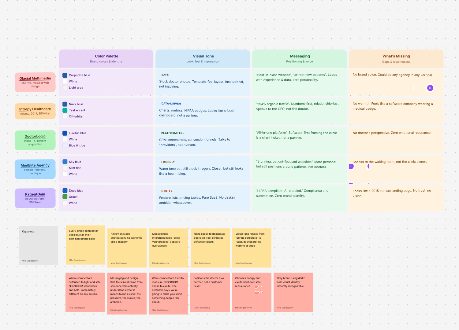
Before touching any design, I mapped the competitive landscape. Five competing agencies — and every single one looked identical: corporate blue, stock photos, safe messaging. None spoke the language of a doctor. None felt like they came from inside the profession.
The opportunity was clear: stop looking like every other agency and start looking like the one that actually gets it.
Information Architecture
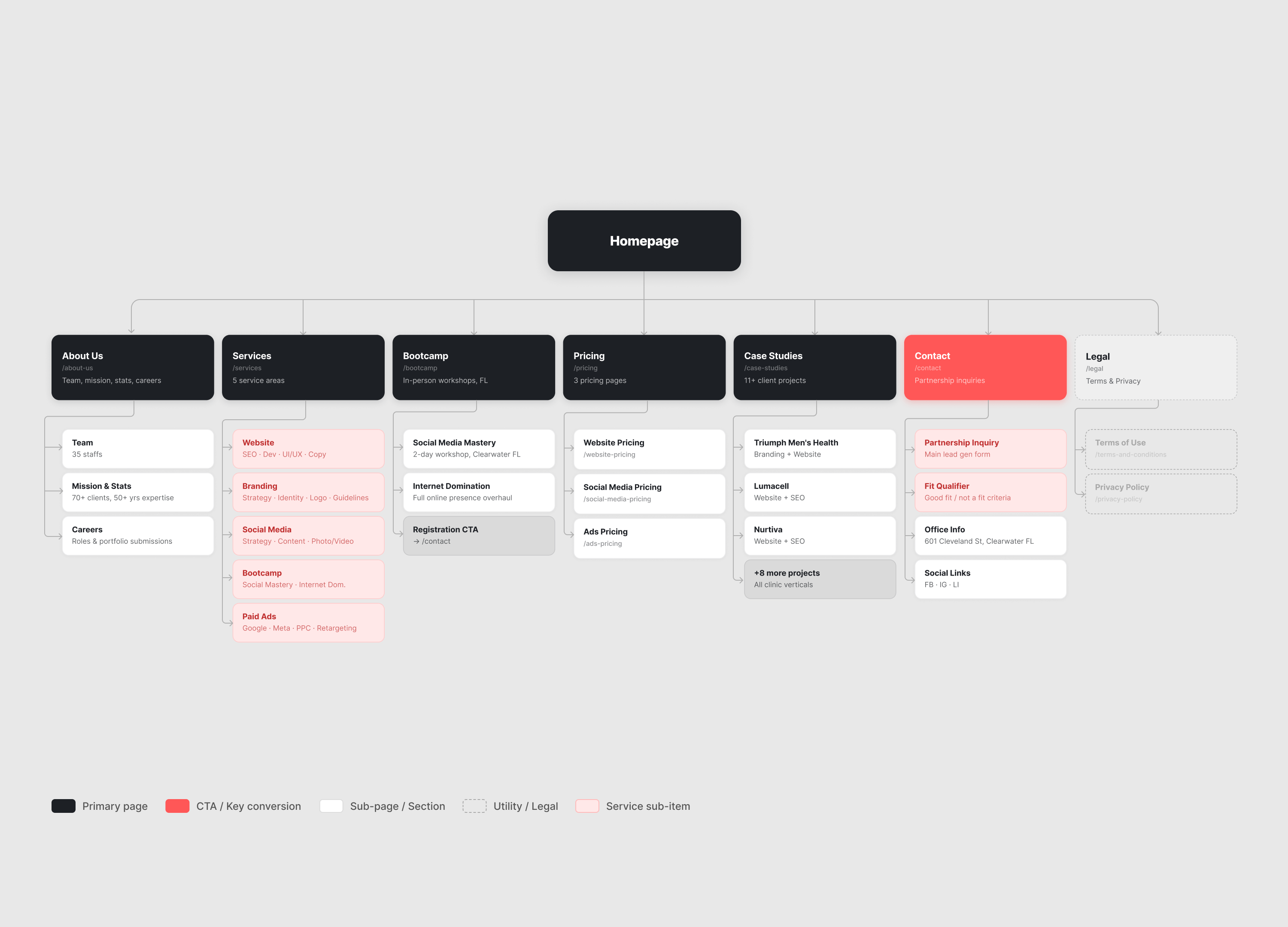
With a clear picture of the gap, I structured the site before any visual decisions.
The architecture had to answer three questions a doctor asks in the first 30 seconds: What do you do? Can I trust you? How much does it cost?
Each question mapped to a section. A clear service overview answered what. Social proof and the founder's clinical background answered trust. Transparent pricing answered cost. The page order followed the doctor's decision sequence — from first impression to signed contract — not our internal org chart.
Design Process
Finding the Visual Direction
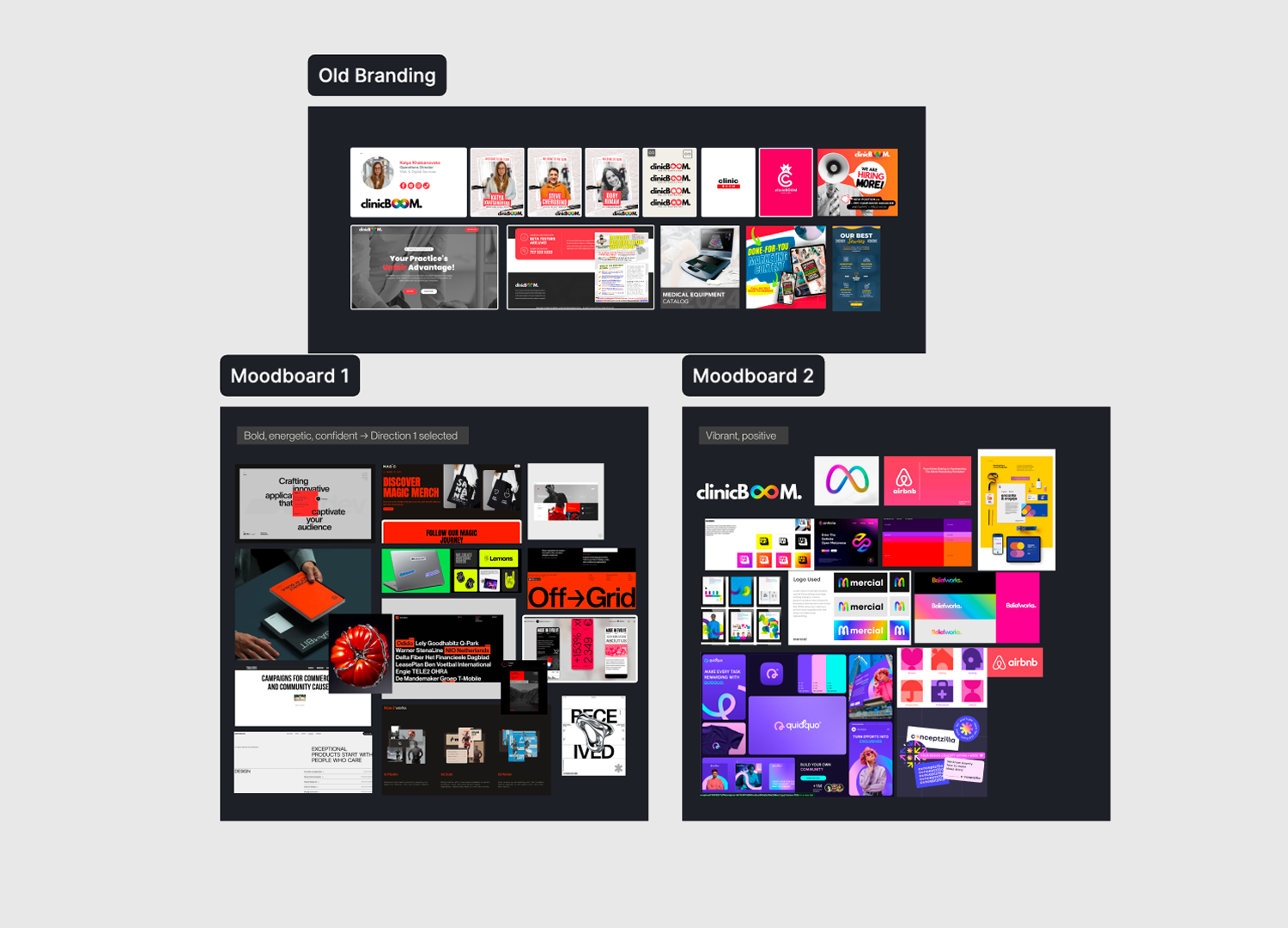
Most healthcare marketing agencies play it safe — clean, clinical, forgettable. Our clients are doctors who want to stand out, not blend in.
I explored two directions. Direction one: bold, high-contrast, energetic — confident and results-driven. Direction two: vibrant and colourful — modern, but too playful for a medical brand.
The team aligned on Direction one immediately.
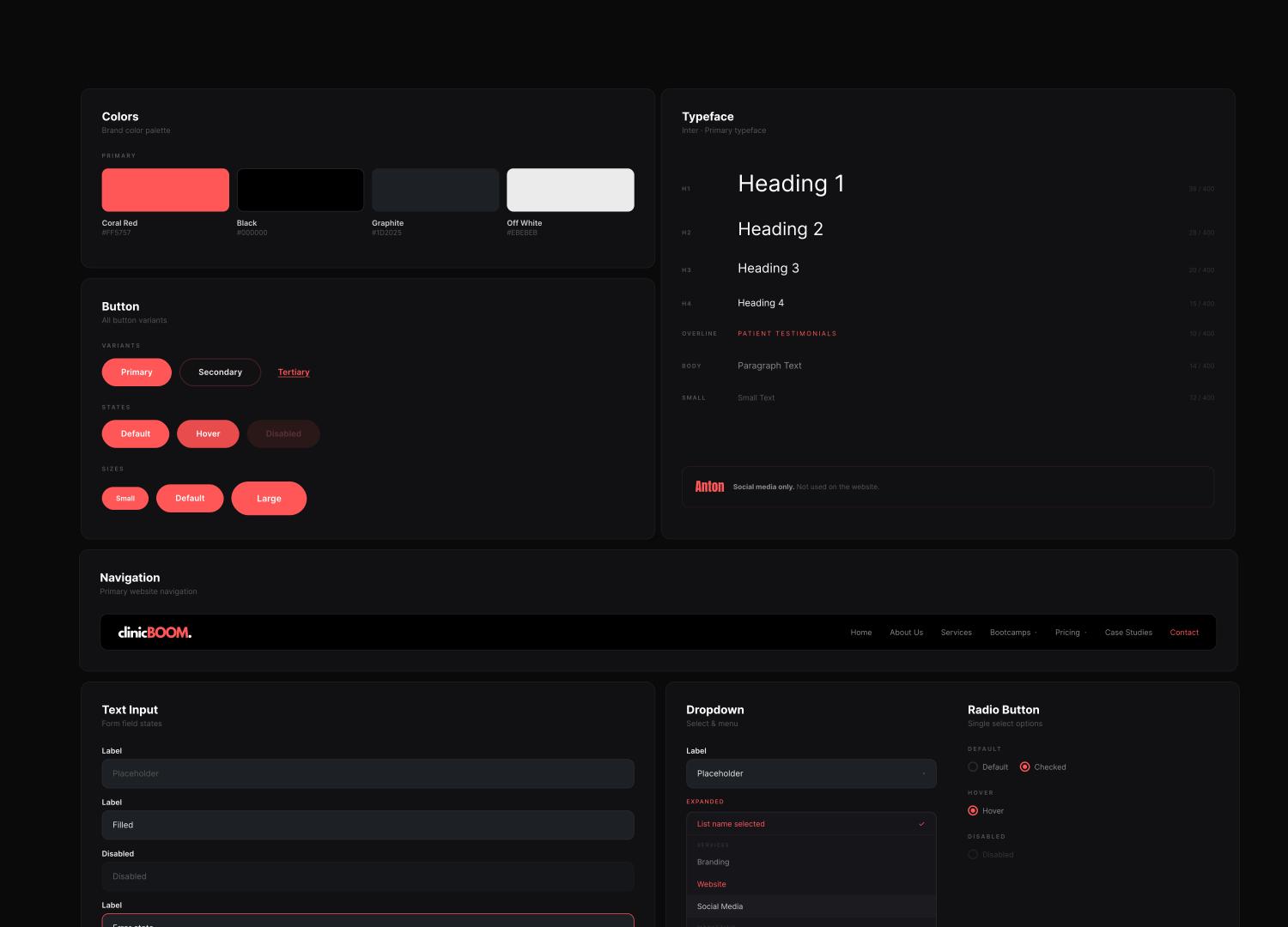
Red · Black · White. Bold enough to stop a doctor mid-scroll. Credible enough to make them book a call.
Building the System
From the moodboard I built the visual foundation — typography, colour tokens, button states, and card components — ensuring consistency across web, social media, and print.
Execution
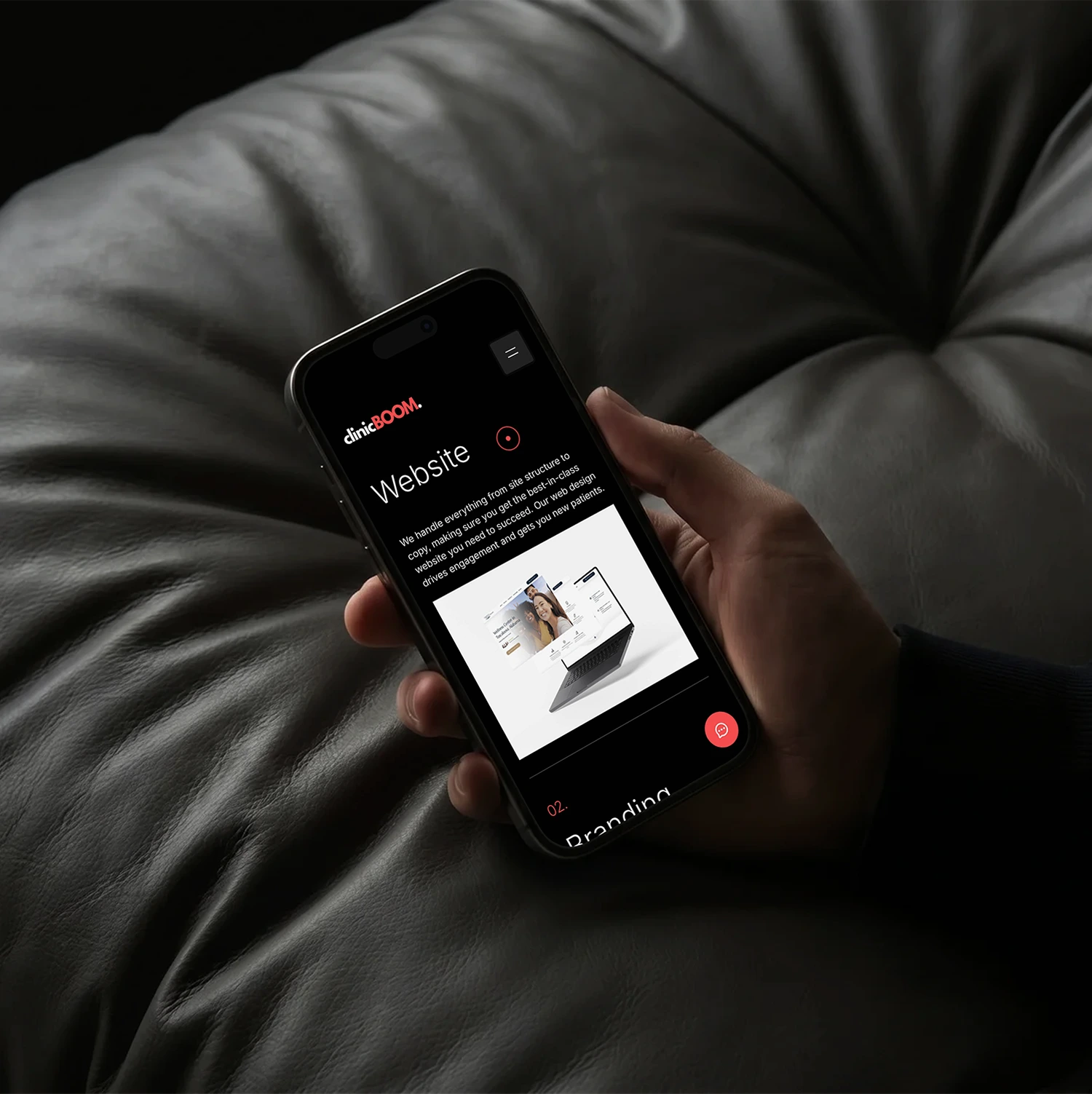
Website
I designed and iterated the site across multiple versions. The first version on Webflow was too complex for the team to maintain independently.
The decision: move to Onepage.io — the same tool we used for client sites. The team could update it without me, and the site became live proof of our own capabilities.
Social Media
Before: inconsistent posts, no visual system. After: a bold, recognisable feed that communicates authority and personality immediately.
One piece of content reached 1M+ views. Monthly reach: 984K.
Physical Touchpoints
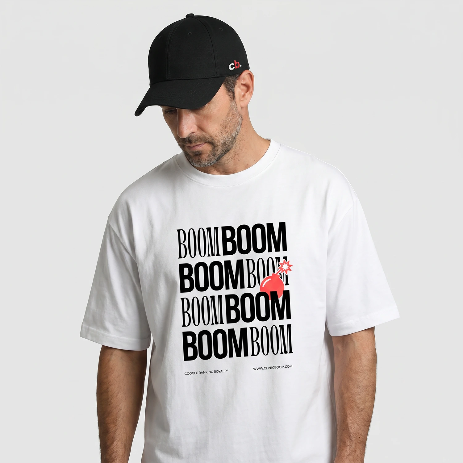
I designed the physical layer of the brand ecosystem for healthcare conferences — ensuring the same visual language that lived online translated seamlessly into the real world.
Events became the primary acquisition channel — each conference bringing 5–6 new clients directly into the pipeline.

Results
Digital Presence — From zero to a recognised brand across web, social media, events, and print.
Instagram — 984K monthly reach, 1M+ views on a single piece of content.
Business — 3 → 40+ active clients in 2 years.
Personal Reflections
Building from zero taught me that the hardest design decisions are not visual — they are strategic. Knowing what to prioritise, what to cut, and what to say no to matters more than any single design choice.
Two things I would do differently:
Track from day one. Without analytics configured at launch, measuring design impact became guesswork. Baseline data is not optional — it is the foundation of every design argument.
Choose tools for the team, not the brief. The platform switch mid-project was avoidable. The right tool is not the most capable one — it is the one the whole team can maintain independently after you step back.