Mapping Skincare Sculptural
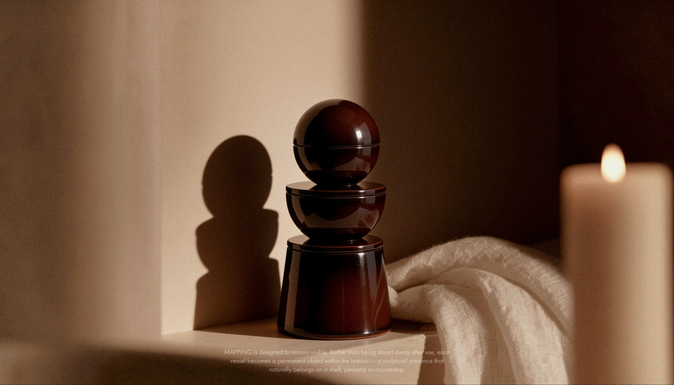
Most skincare systems prioritize facial treatments while treating body care as secondary. MAPPING introduces a 3-piece stackable system that treats the skin as one continuous surface, designed as a sculptural interior object for modern spaces.
Intro
The Beauty Industry Worships the Face
Everything above the neck gets serums, rituals, and packaging designed to be displayed. Everything below it gets a plastic bottle hidden in a cupboard. The ritual is divided because the products are.
I began wondering what body care would look like if it had always been treated with the same importance as facial skincare. Looking beyond the category, I explored body cartography, topographic mapping, and spatial rituals to rethink how skincare could be experienced.
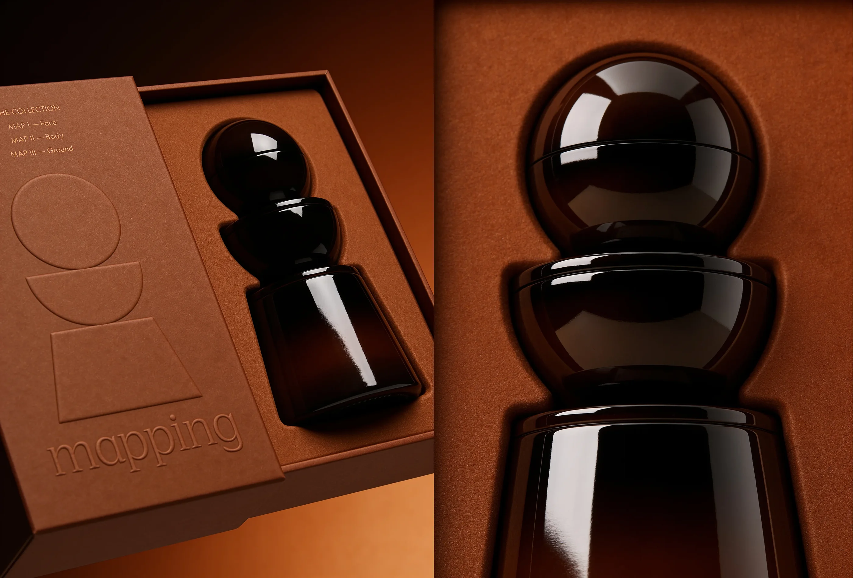
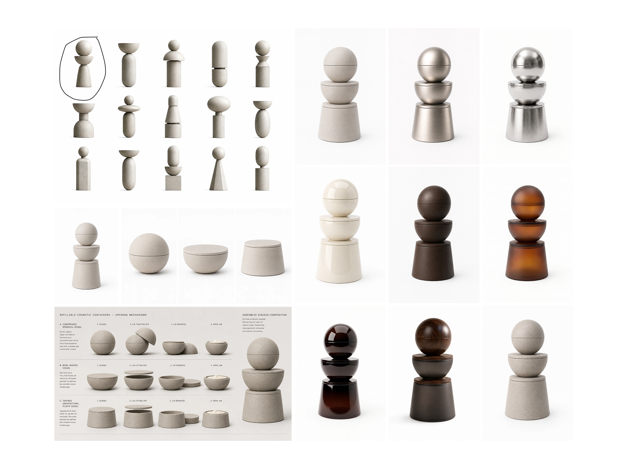
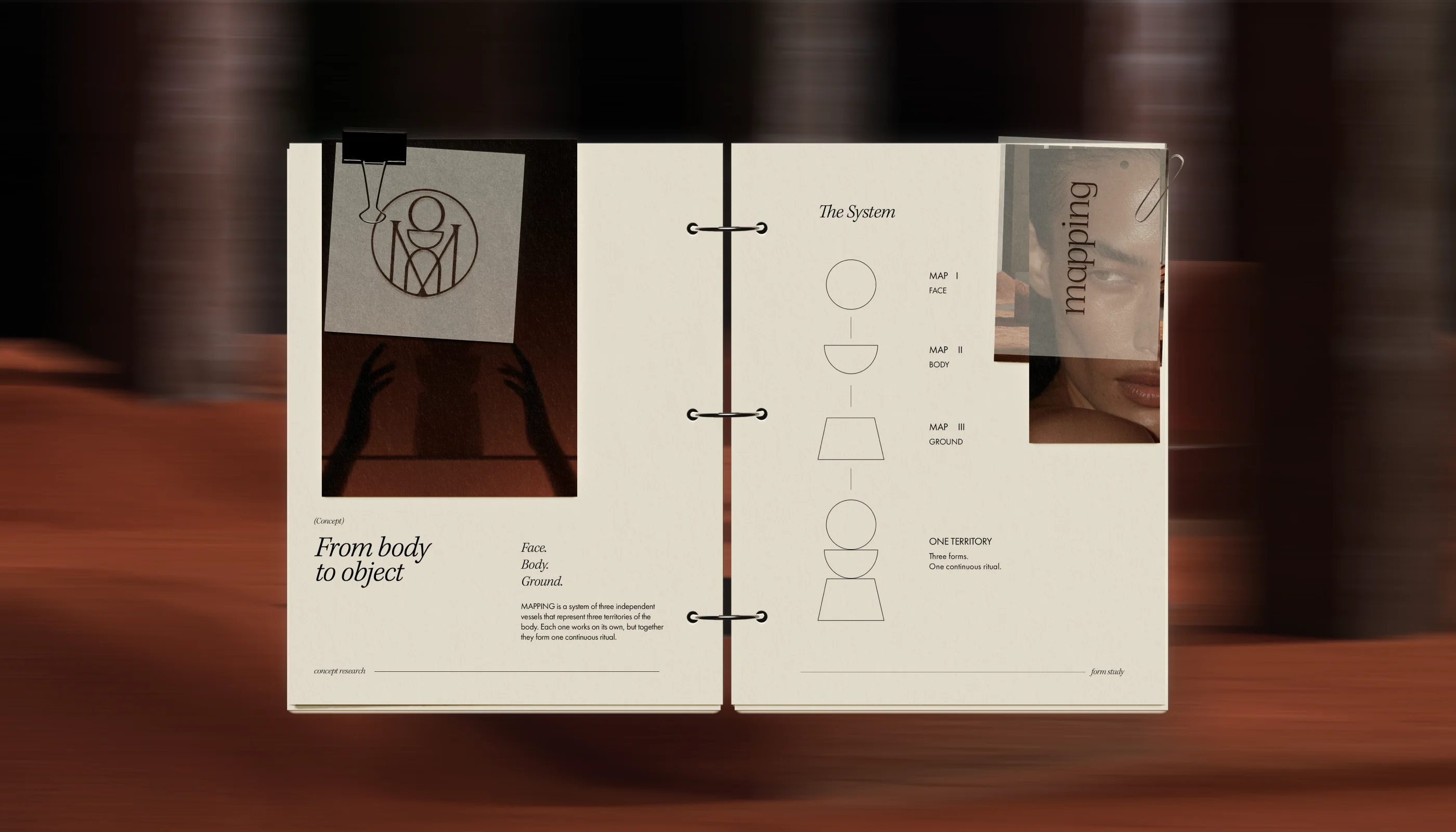
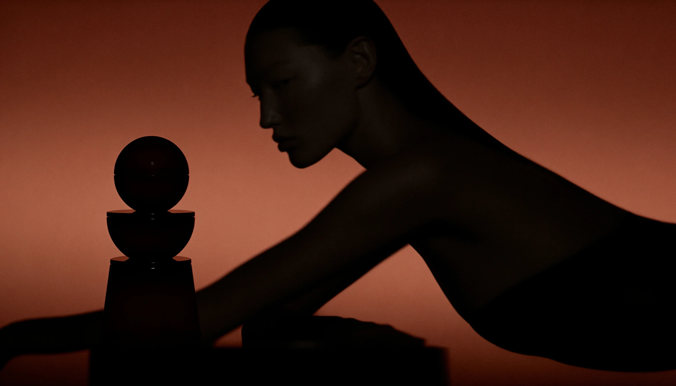
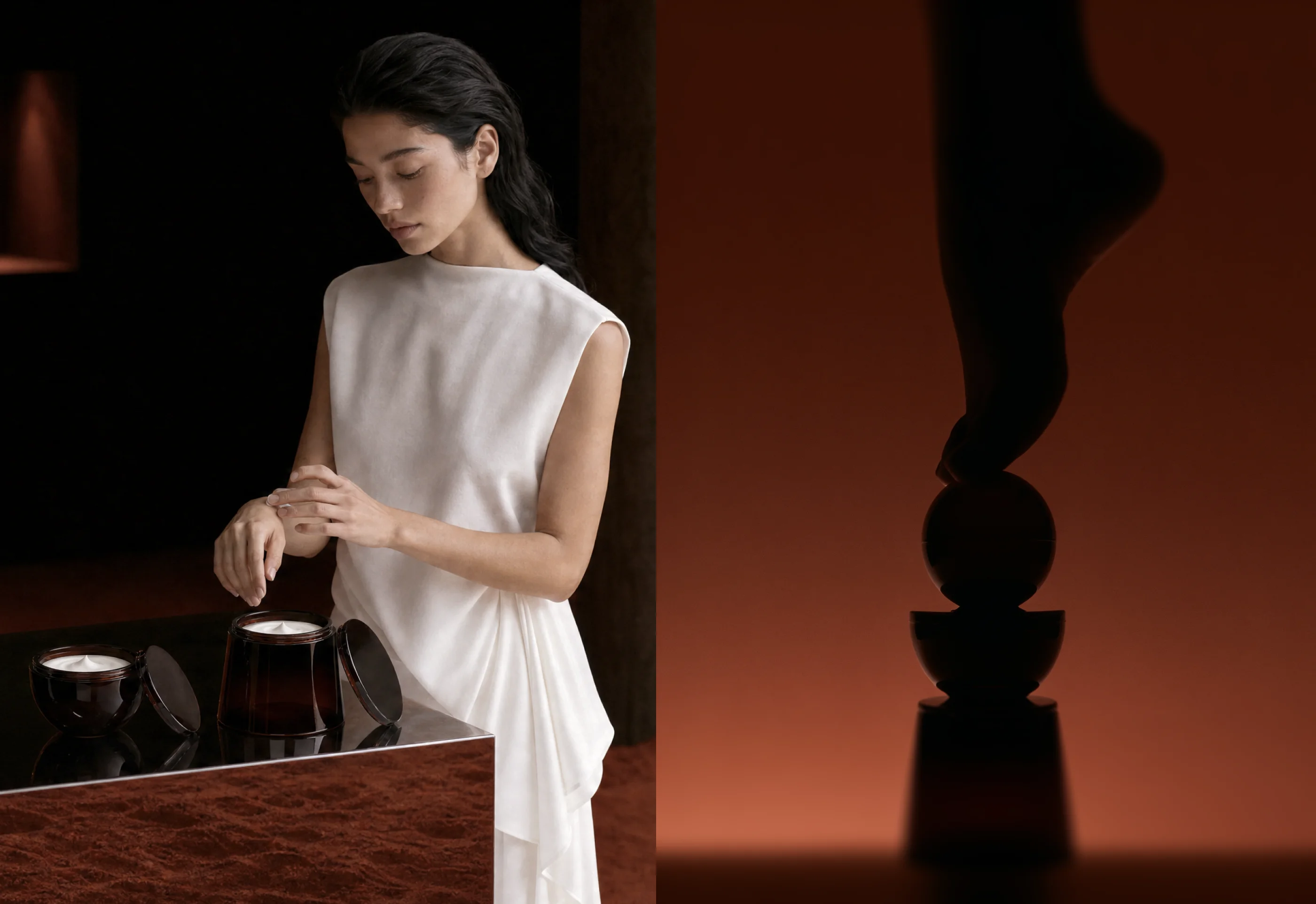
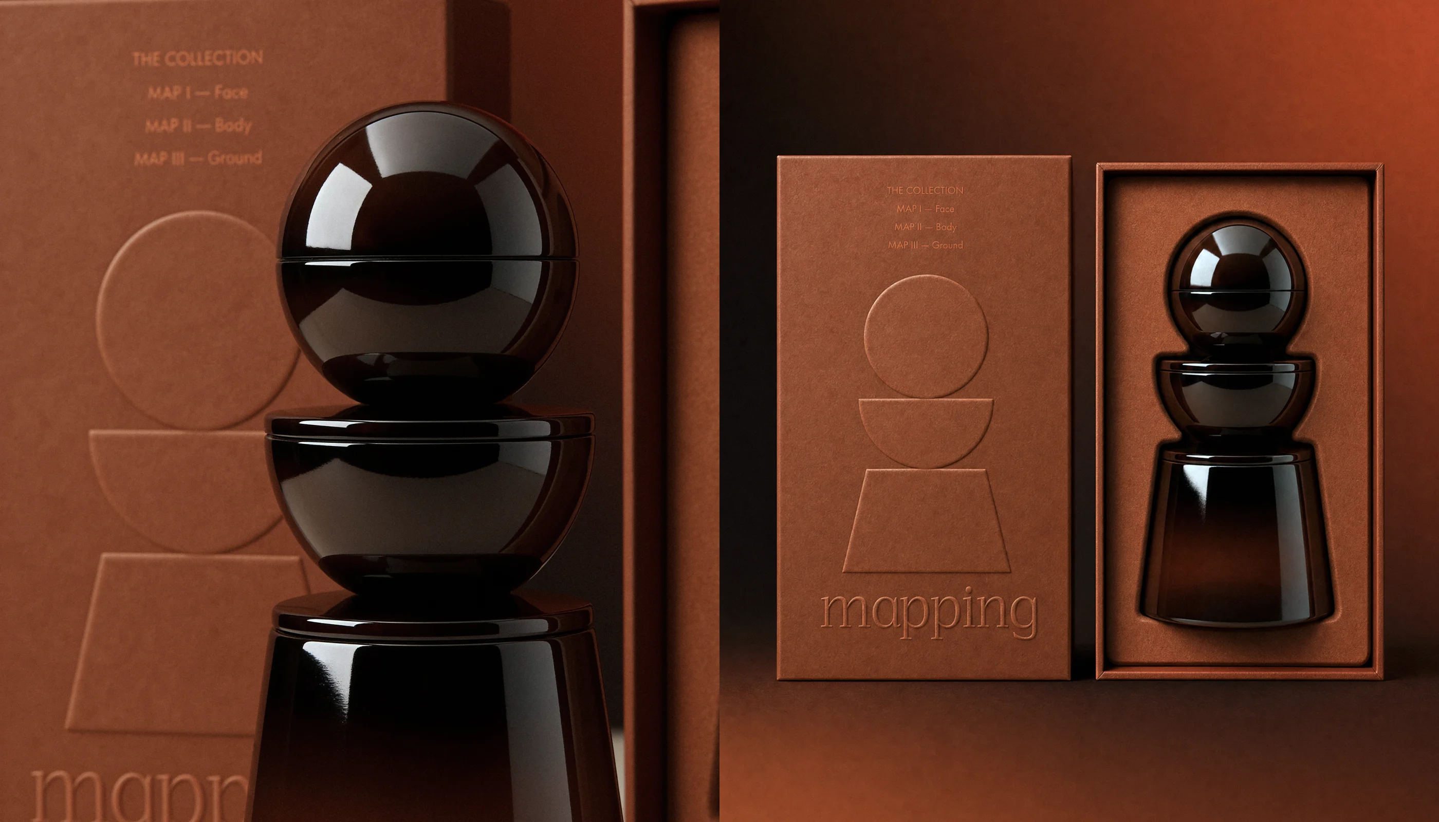
That exploration became MAPPING—a sculptural skincare system built on one idea: your body is one continuous territory. Instead of separate products, I designed three modular vessels that stack into a single sculptural object: MAP I — Face · MAP II — Body · MAP III — Ground. Stacked, they function as an interior sculpture. Separated, they become a ritual that moves from head to toe.
Strategy
Finding Meaning Before Finding Form
The first images I generated looked like every other luxury skincare campaign—marble, water, soft lighting, glossy packaging. Beautiful, but interchangeable. That’s what generative models produce by default: patterns learned from the category itself.
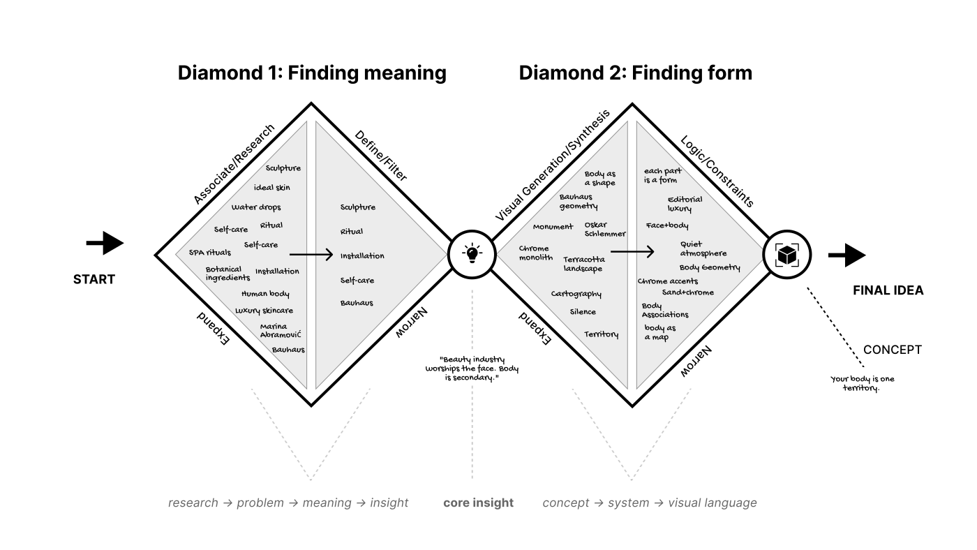
Instead of searching for a style, I stepped back and used the Double Diamond framework to rethink the concept.
The first diamond defined the problem and uncovered the core insight. The second explored multiple visual directions before refining them into one cohesive system.
Only then did I begin generating images. The model wasn’t inventing the concept anymore—it was executing a creative direction that had already been defined.
Development
Nothing existed, so I built it from the ground up
A campaign needs a product, a set, and a cast before a camera is even picked up. I had none of them—and no established rules for how they should look. So, I built the entire world from scratch.
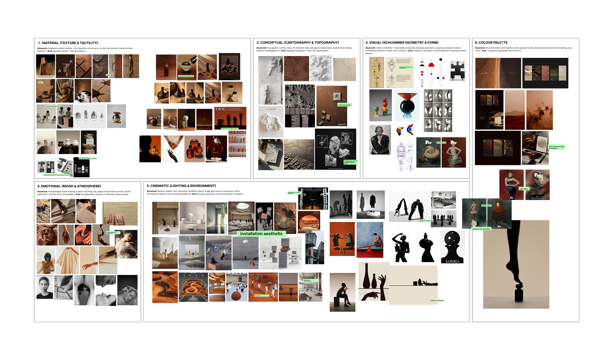
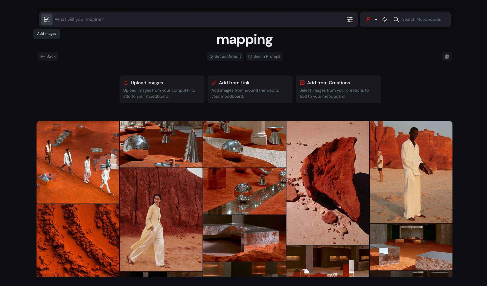
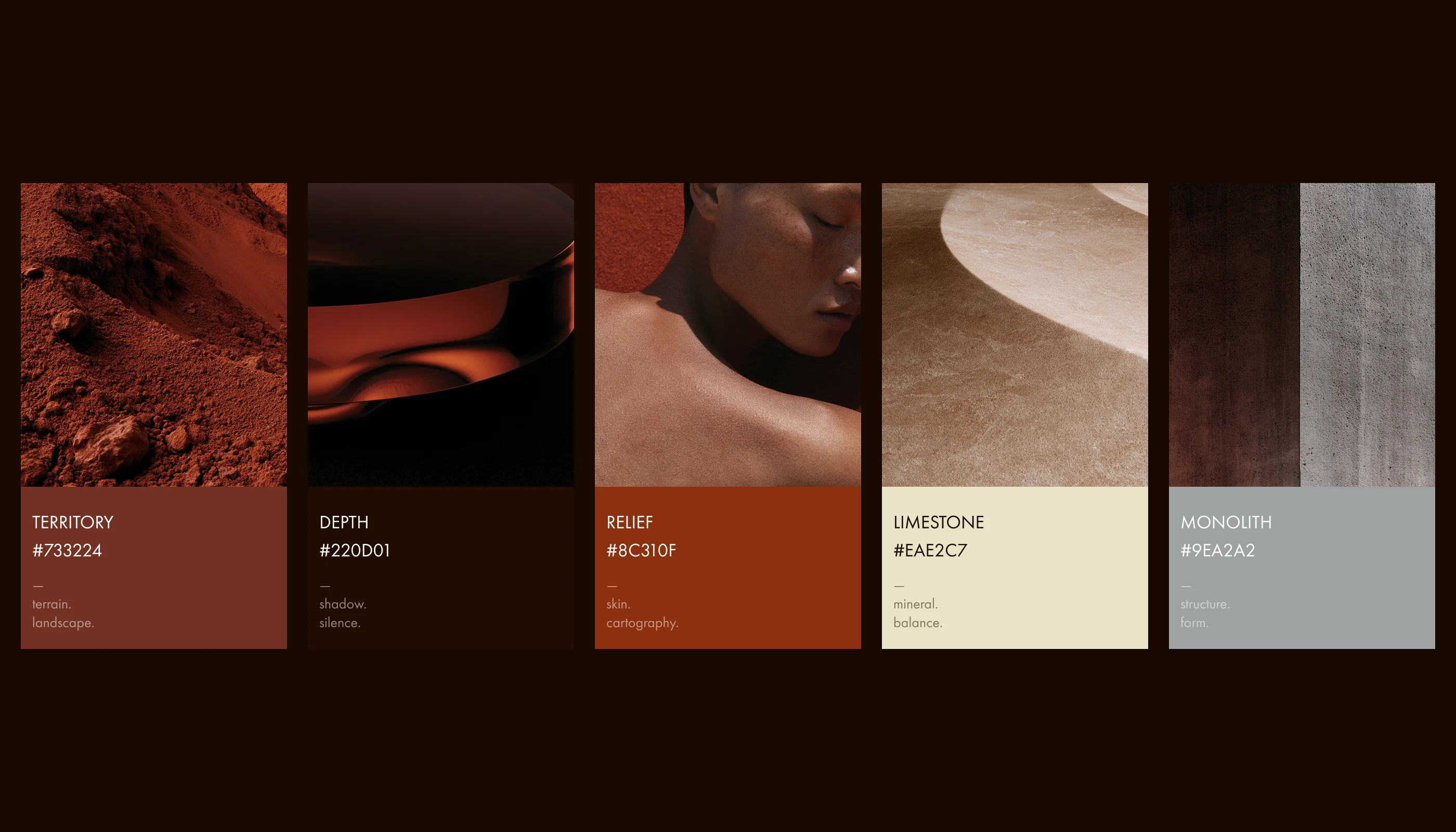
The Rules: Instead of collecting references by aesthetic, I organized them by function. I created five moodboards, each answering for one layer of the final image: Materiality, Cartography, Geometry, Emotion, and Cinematic Lighting. By separating these, I could build each layer independently. This meant that a strong image couldn’t accidentally pull the brand in the wrong direction; it had to earn its place in the system. Once defined, I loaded these references into Midjourney as style anchors. The model stopped trying to interpret my descriptions and started working from the brand’s DNA itself. My job shifted from making images to refining them—mercilessly discarding frames that didn’t feel like MAPPING.
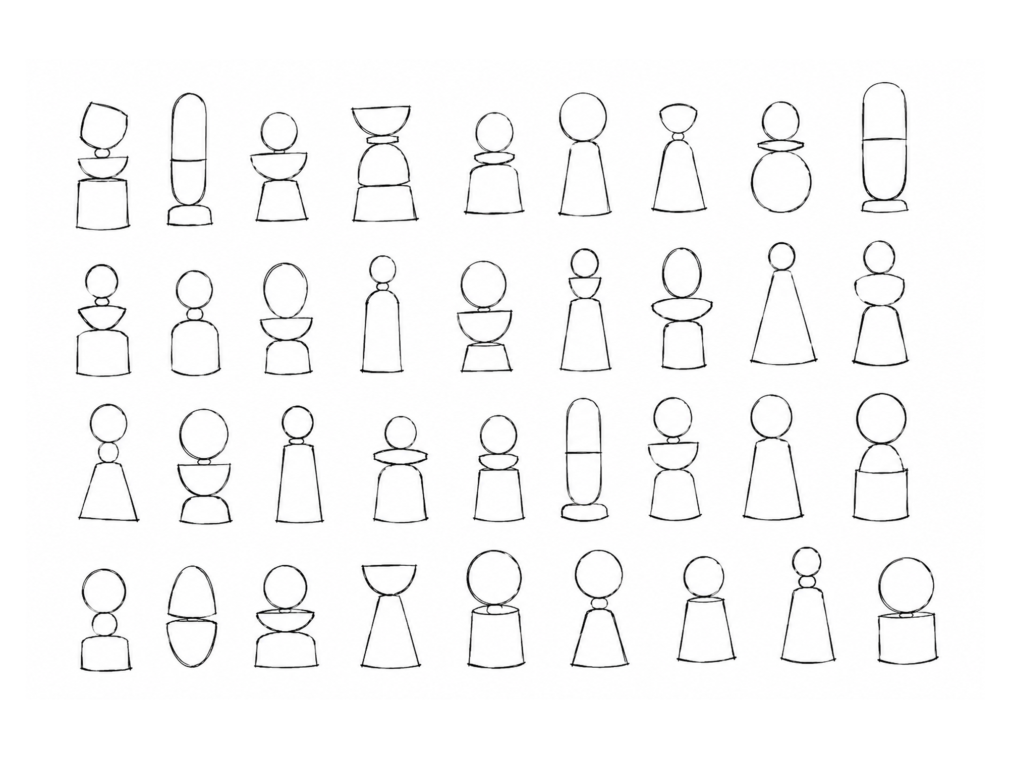
The Product: I started with 40 hand-drawn silhouettes to lock the proportions before any model saw them. I focused on a three-part grammar—sphere, bowl, plinth—iterating on materials like amber glass and brushed steel. The focus was on the joinery: ensuring the three vessels could lock into one sculptural object and come apart again seamlessly.
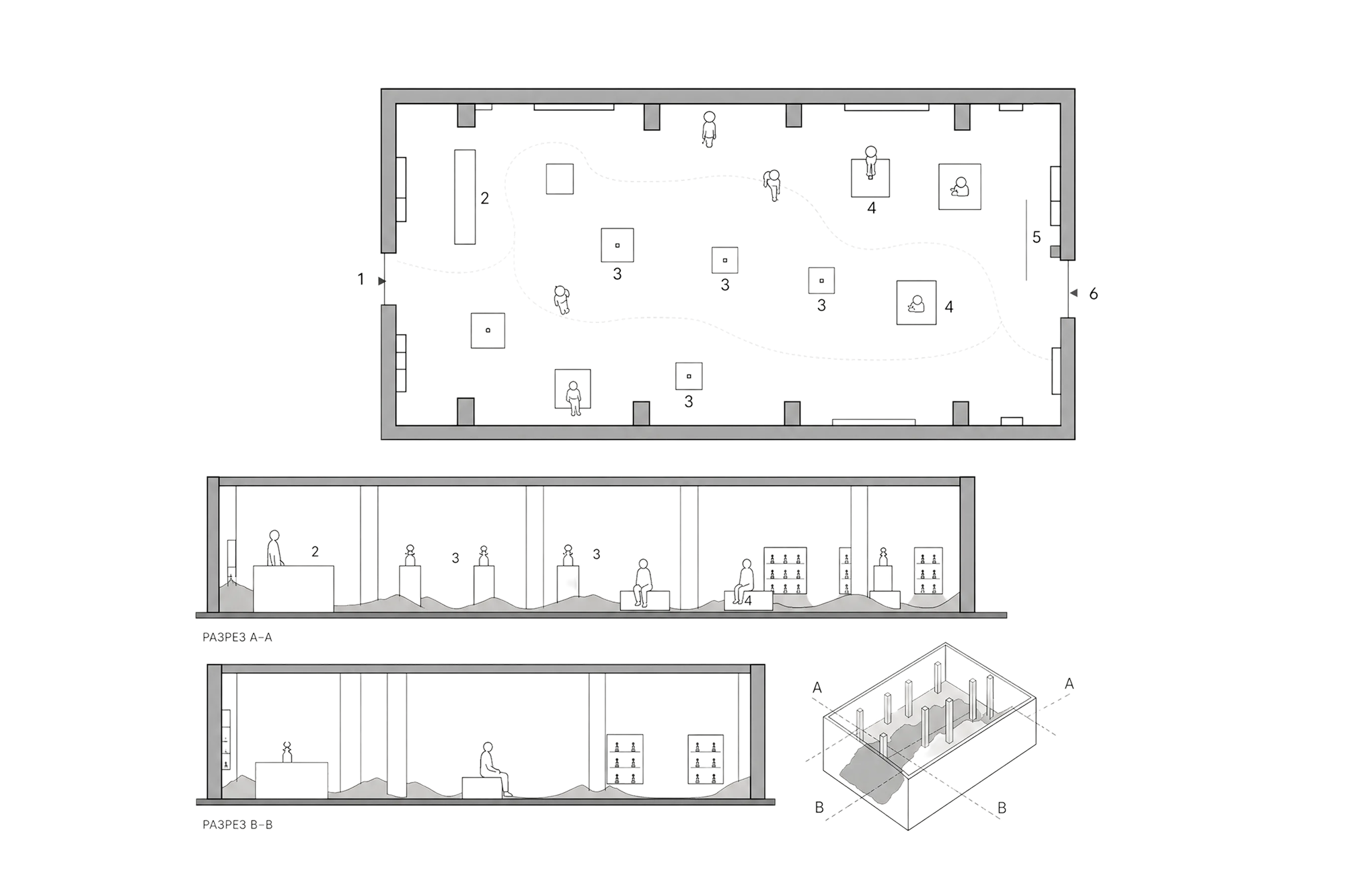
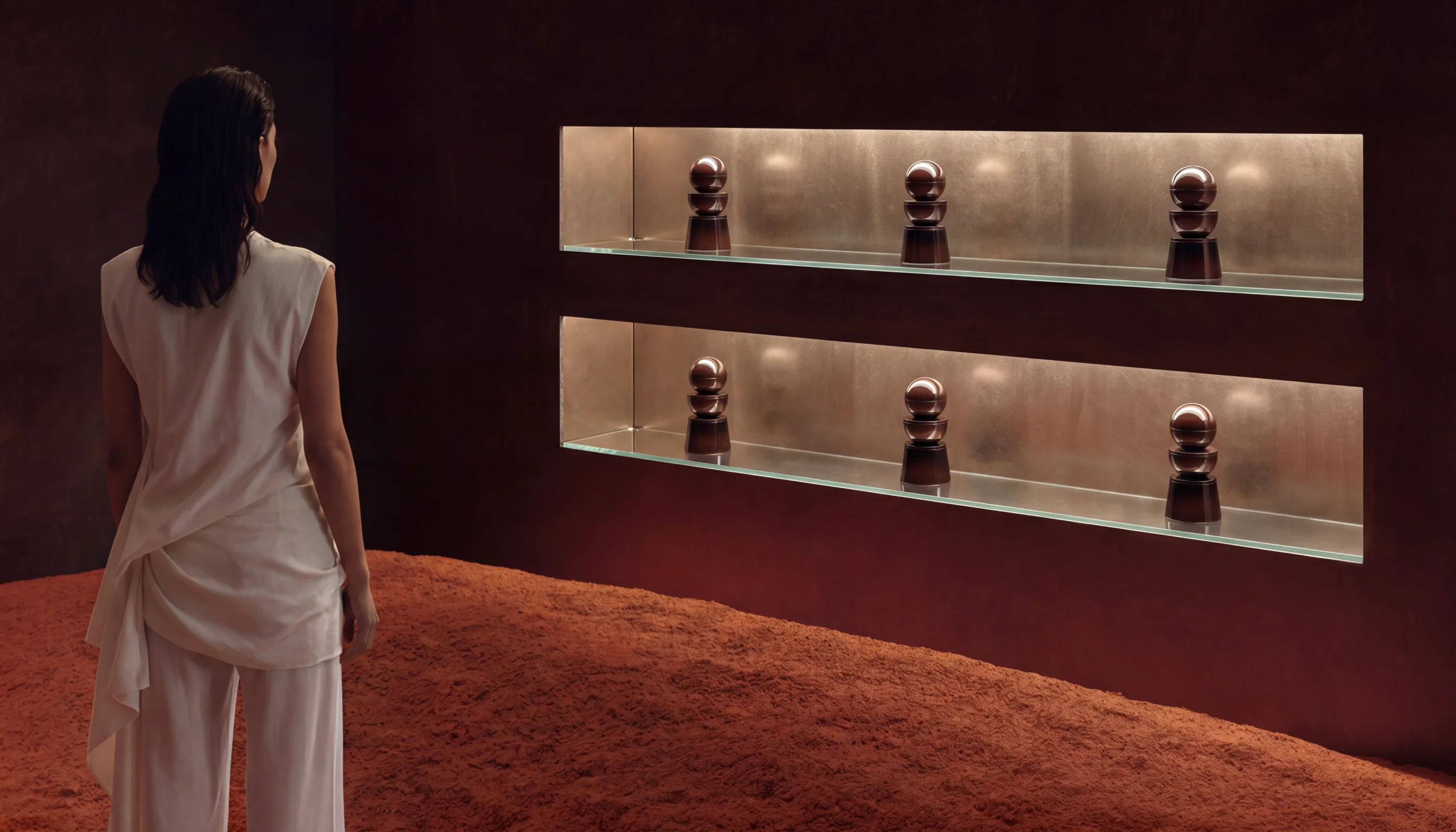
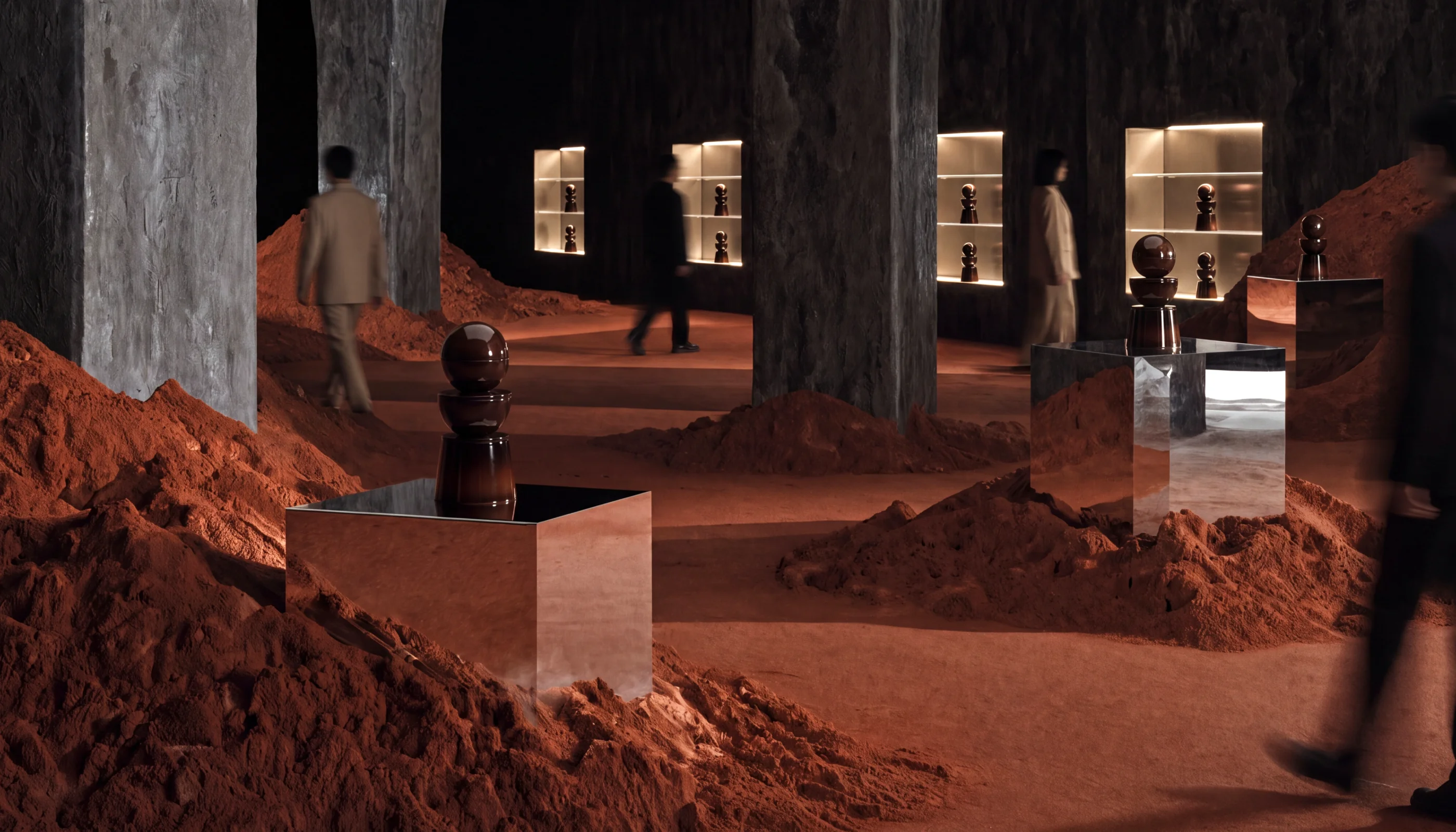
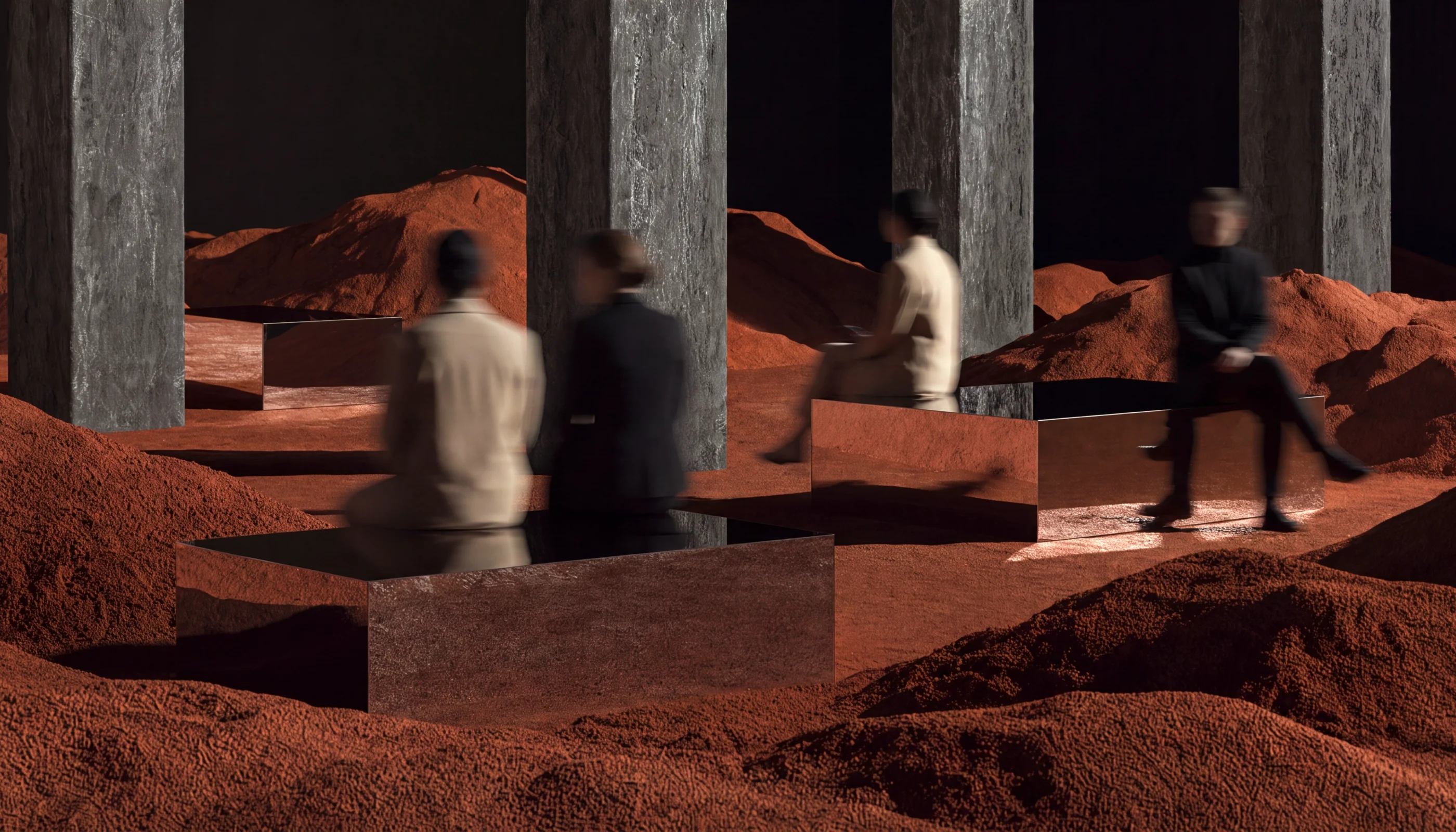
The Space: I developed a terracotta gallery void until the lighting held its own, then documented it properly—floor plans, sections, and axonometrics—to map out visitor flow and pedestal placement.
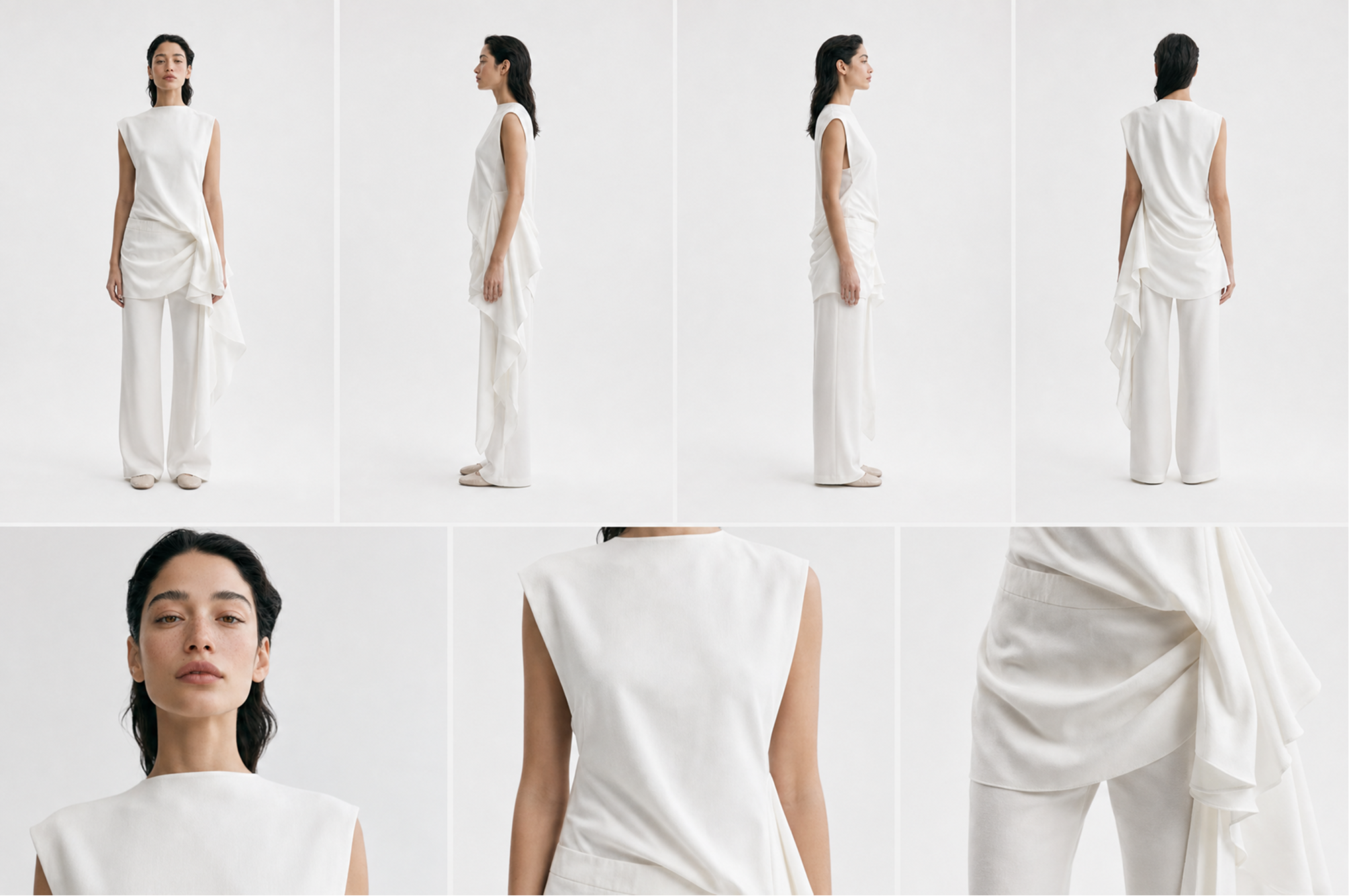
The Cast: I locked in one ambassador. I generated a full turnaround sheet, including wardrobe and fabric details, to ensure the same face and garment survived every angle. Character consistency is where most generative campaigns fall apart—this control sheet was the fix.
Execution
One Idea, Carried Across Five Media
A single beautiful frame proves nothing. A concept proves itself only when it survives translation—into an object, a room, a brand, and a film—and still reads as one thing.
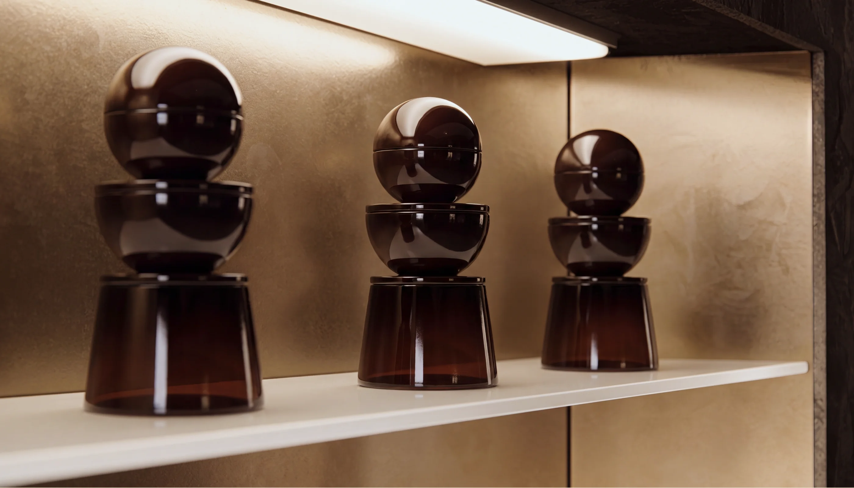
The Campaign: The vessels were set into their display niches with reflections that physically agree with the room, while the ambassador was composited across every angle. I added subtle motion-blurred visitors to give the space a real-world scale, moving it away from the “empty render” look.
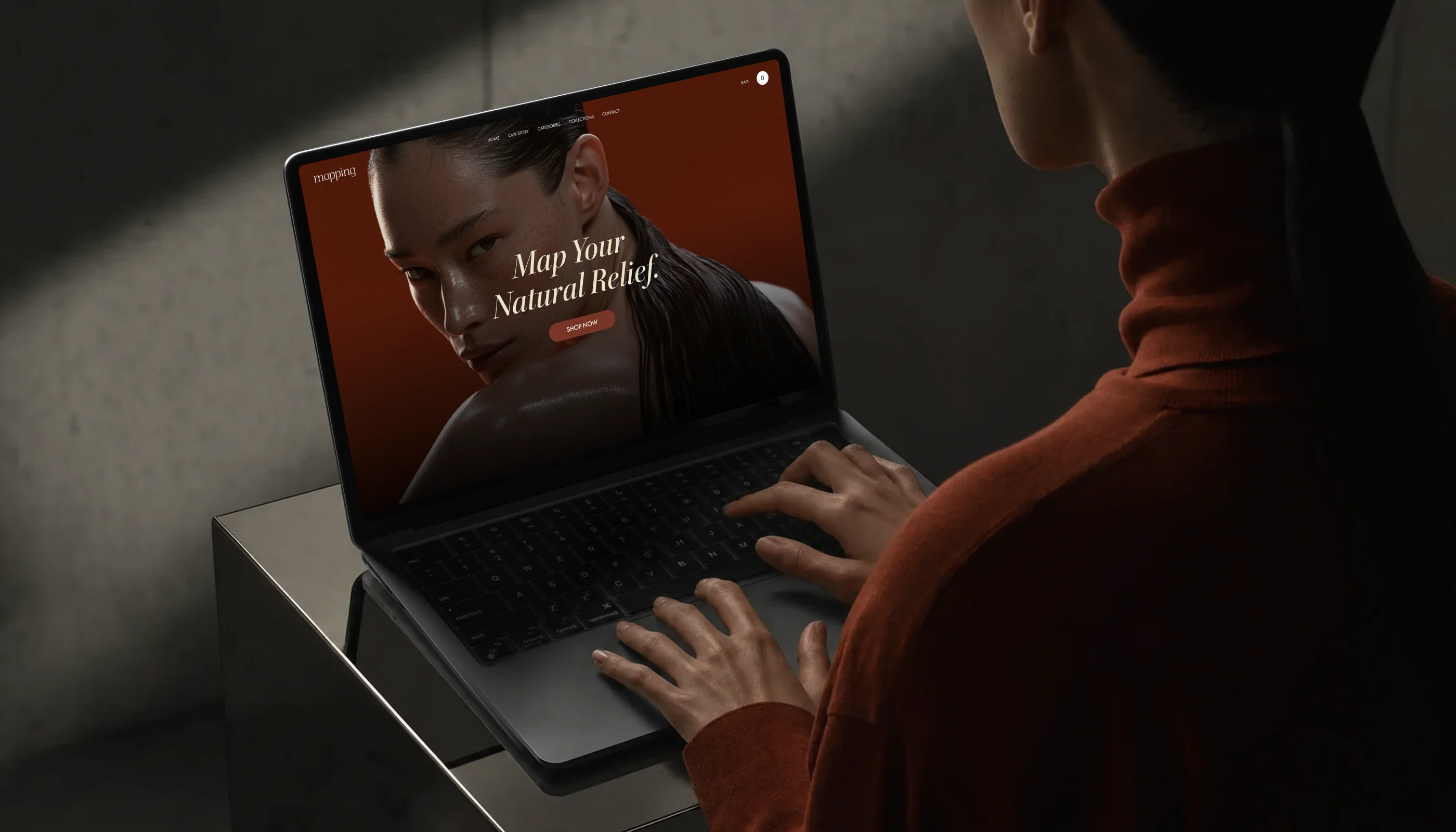
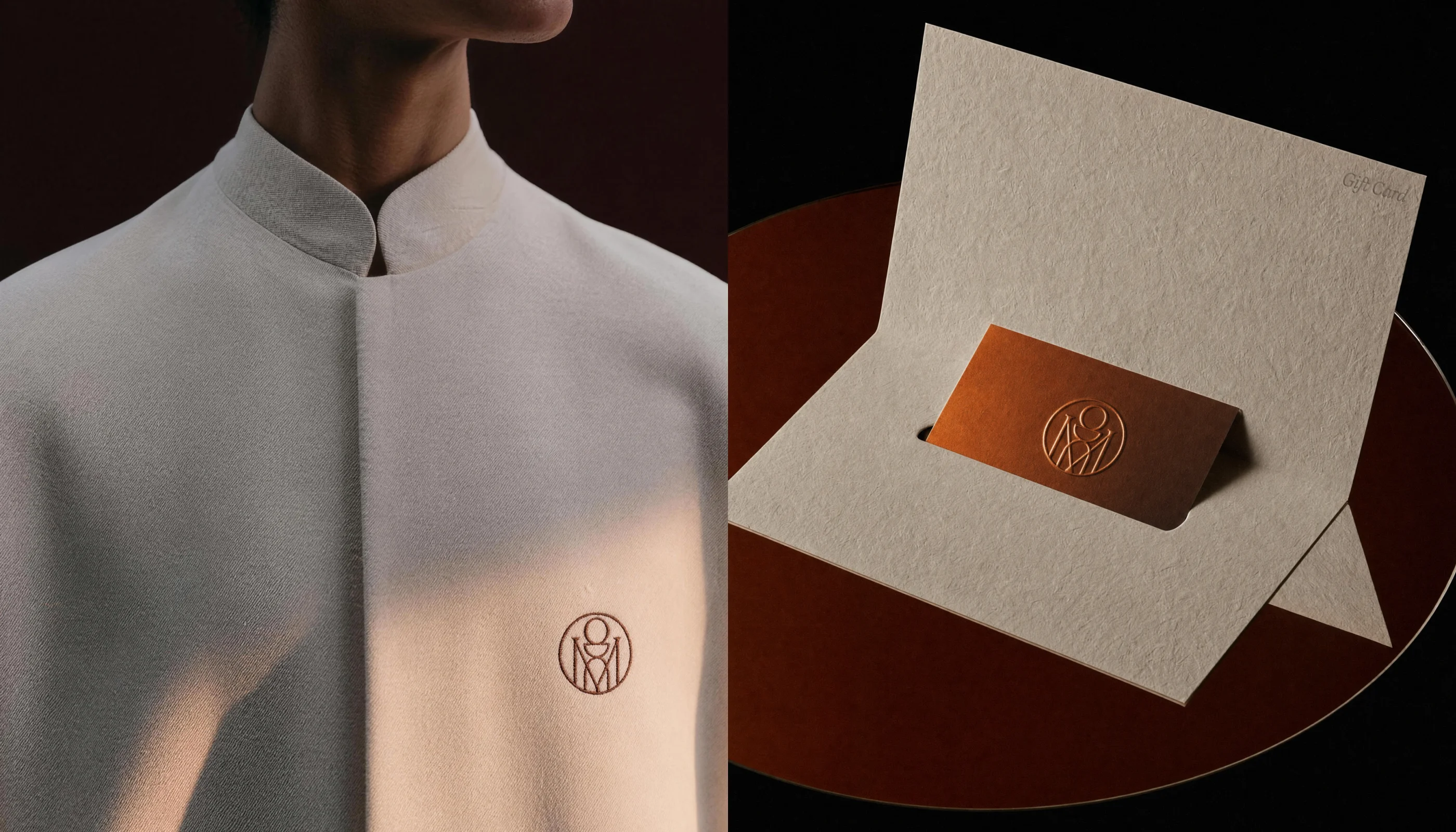
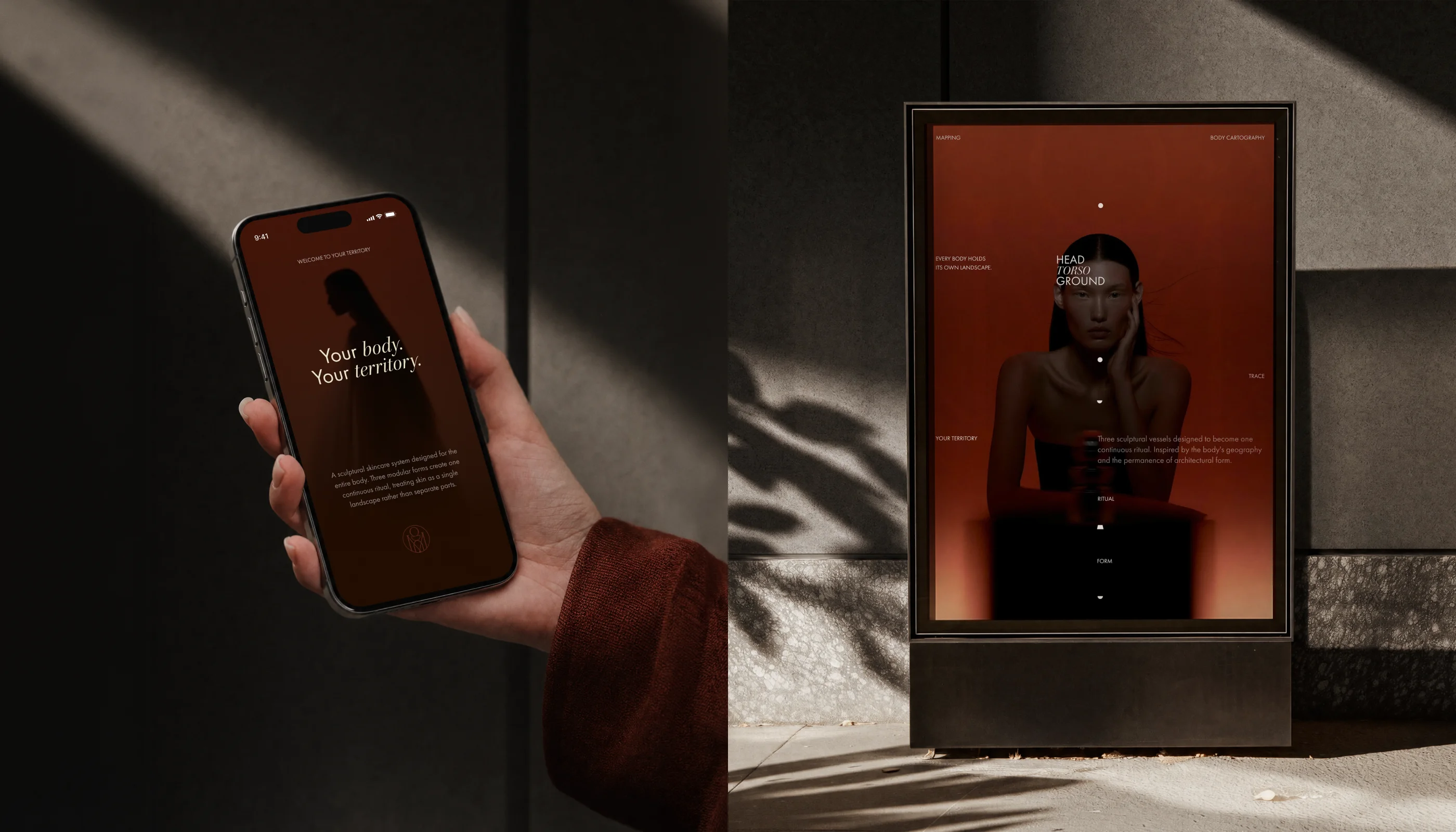
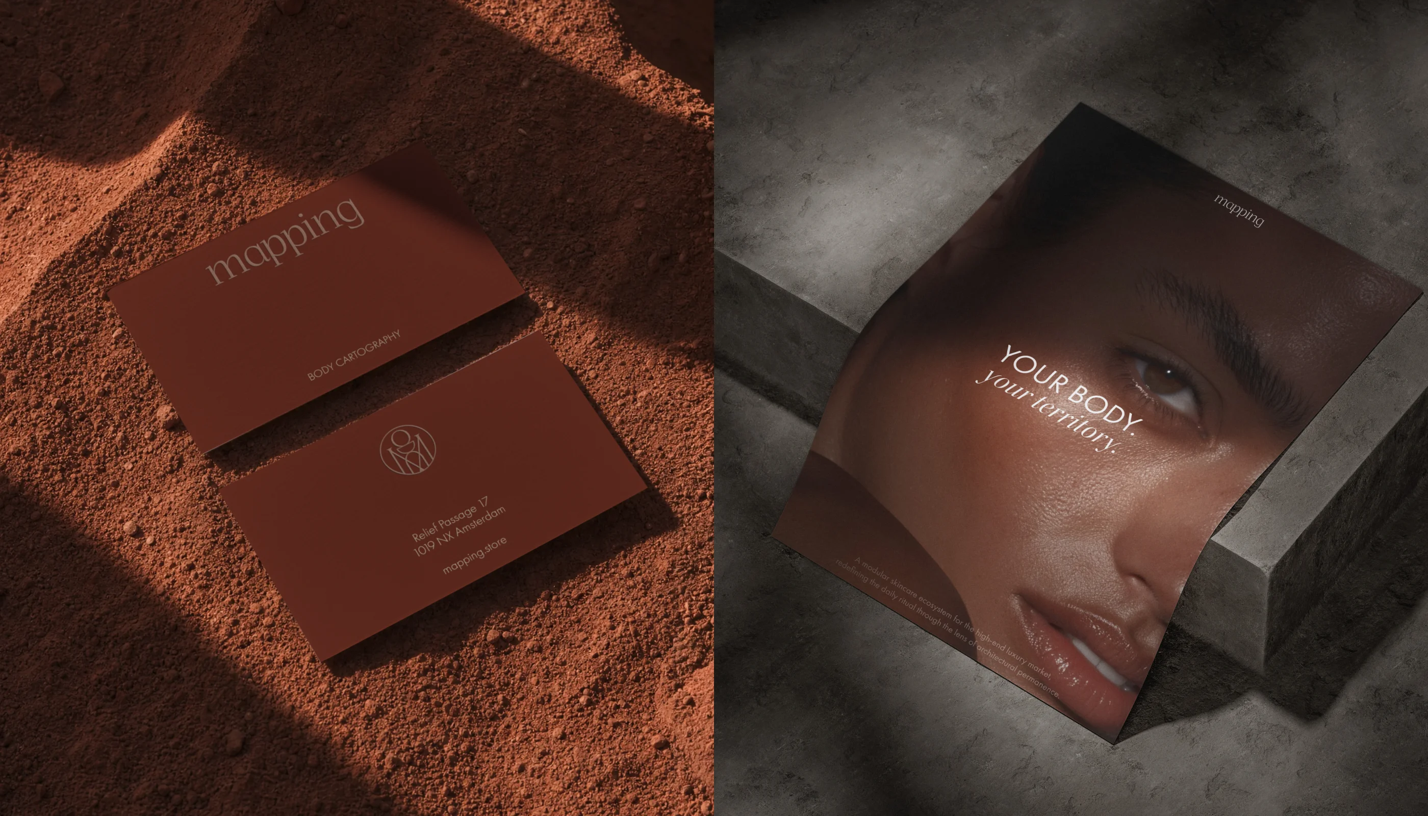
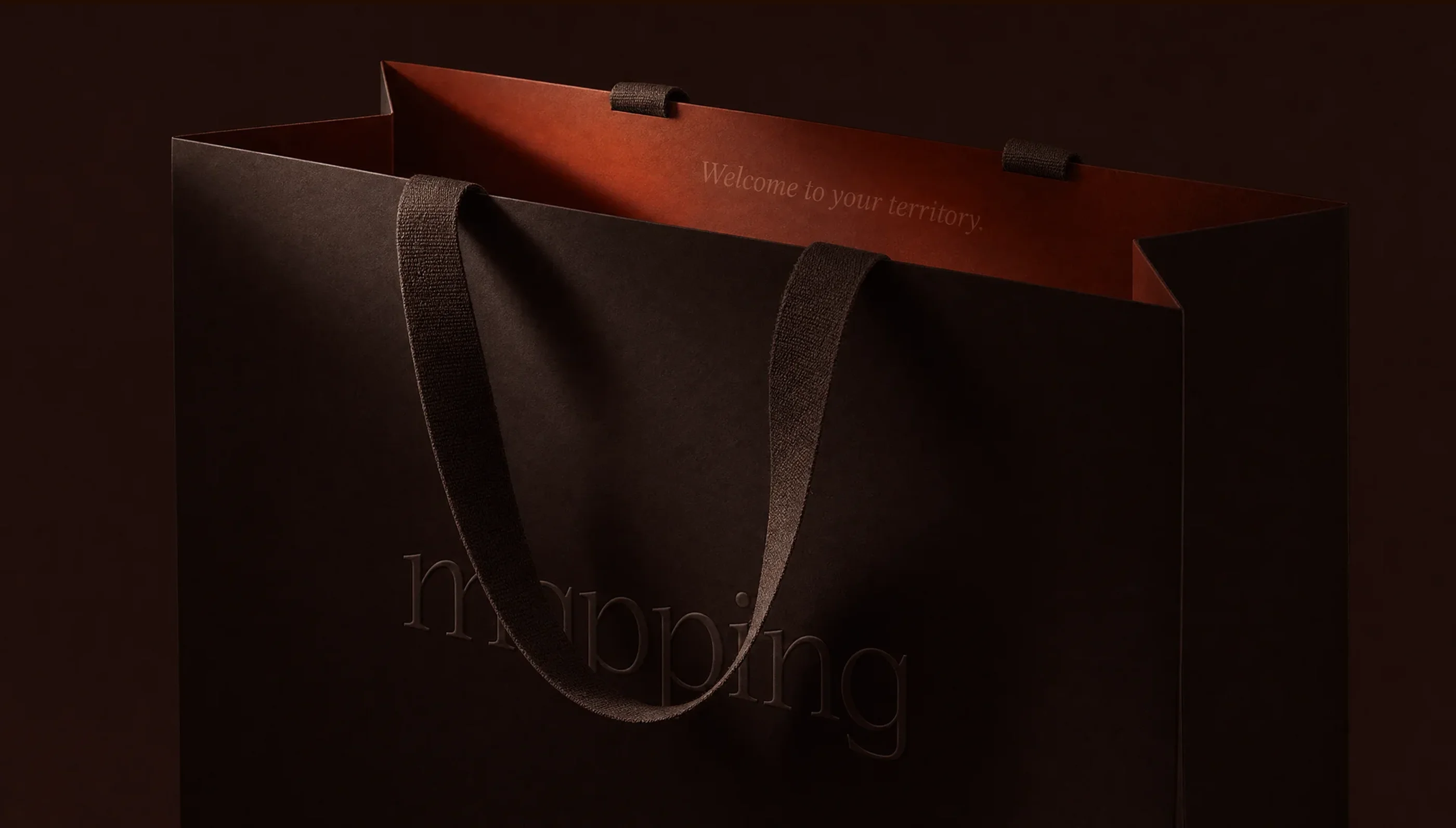
The Brand: I extended the identity to blind-embossed packaging, a minimalist monogram applied to uniforms and stationery, and e-commerce UI integrated into a real-world lifestyle context.
The Film: I directed cinematic interaction shots built around natural hand movement and glass reflection, held free of distortion, and scored with a custom ambient soundscape to give the gallery a sound as well as a look.
Reflections
Orchestrating the Full Vision
Managing a campaign from industrial form and retail architecture to identity and film is a massive undertaking. Usually, this requires a large production studio with fragmented workflows. By taking ownership of every discipline, I was able to maintain one consistent visual logic throughout the entire ecosystem.
Speed is the greatest advantage here. By cutting out multi-week render cycles and physical set builds, I could take a concept that usually wouldn’t survive a budget conversation and bring it to a finished, high-fidelity campaign. It allows for a much more agile creative process where ideas are judged by their quality, not by the cost of testing them.
At the end of the day, AI tools are just accelerators. They can generate infinitely in every direction, but they lack direction. What made this project work wasn’t the software—it was the discipline of sketching by hand, setting the rules before prompting, and having the courage to throw away the majority of what the machine gave back.