Healthcare Website
for Conversion
A premium regenerative medicine network across 7 Florida locations. Every visitor who leaves without booking is real money lost. Every design decision had one job: convert a visitor into a booked patient.
Intro
Problem
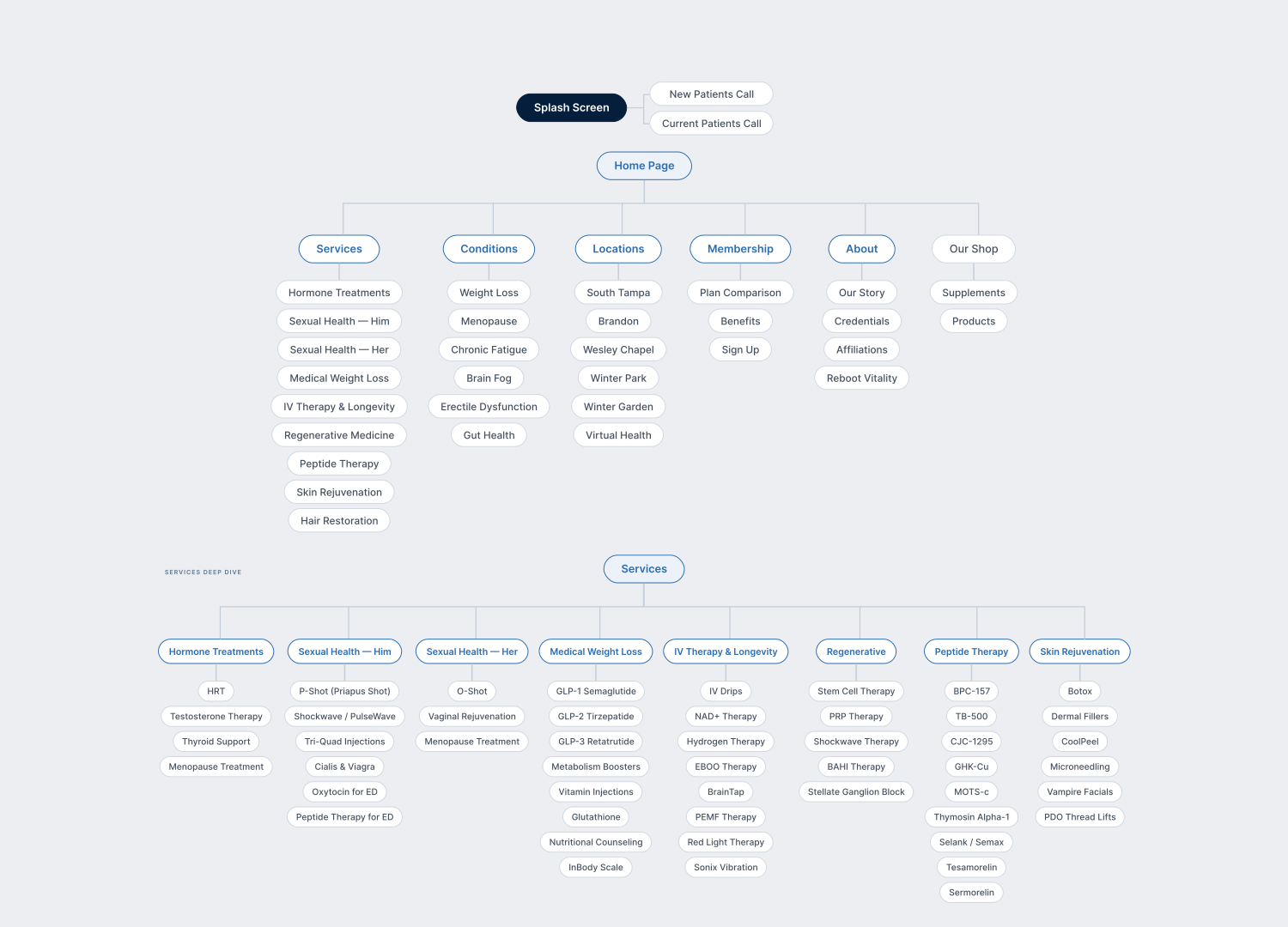
The website had 30+ treatments, 7 locations, and no hierarchy. Patients arrived, couldn't find what they needed, and left without booking.
Solution
I restructured the platform around one idea: get the right patient to the right answer fast. A hub-based navigation replaced the flat structure. A lightweight visual system established clinical trust without sacrificing speed to market.
Outcome
27.4K
Organic clicks in 12 months, site launched from zero
3.5M
Search impressions, driven by hub-based IA
~30 → top-15
Climbed in average search position across target keywords
21.8K
Active users found their way through the new structure
Client retention
Same client returned for 3 more brands
The UX Audit
The audit revealed the core problem immediately. 30+ treatments sat at the same hierarchy level — no grouping, no priority, no clear entry point for different patient needs.
5 Patient Profiles
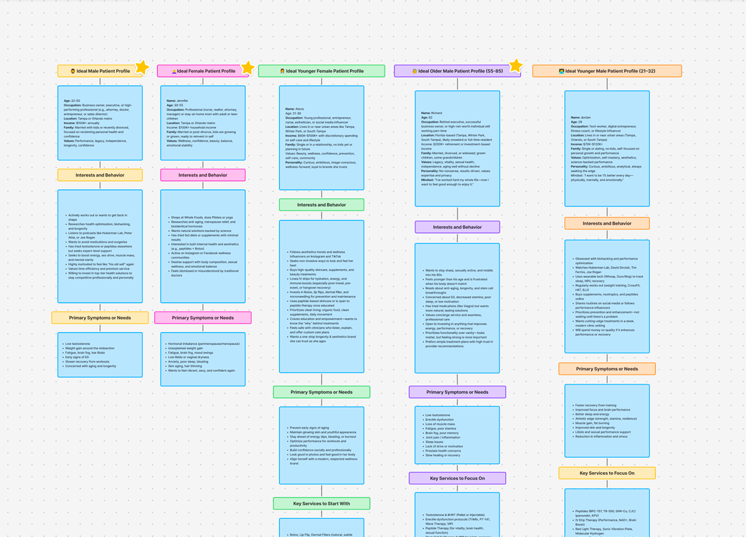
A 32-year-old managing hormonal imbalance and a 62-year-old executive seeking longevity both landed on the same homepage. I mapped 5 patient profiles using clinic intake data — their symptoms, motivations, and the trust signals each group needed before they would book.
The reframe: stop selling treatments. Start solving specific fears.
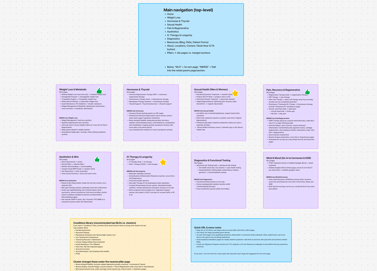
Two Layers. One Clear Path.
The client had 30+ services and conditions with no clear grouping. My job was to organise everything into categories that made sense to a patient, not just to the clinic.
A patient knows their symptom. They rarely know the treatment name. So I structured the site around both — services for those who know what they want, conditions for those who only know what is wrong.
Some services did not map cleanly to a single category. I worked closely with the SEO team to test different groupings, balancing the patient's mental model with search visibility.
Clinical Trust at Speed
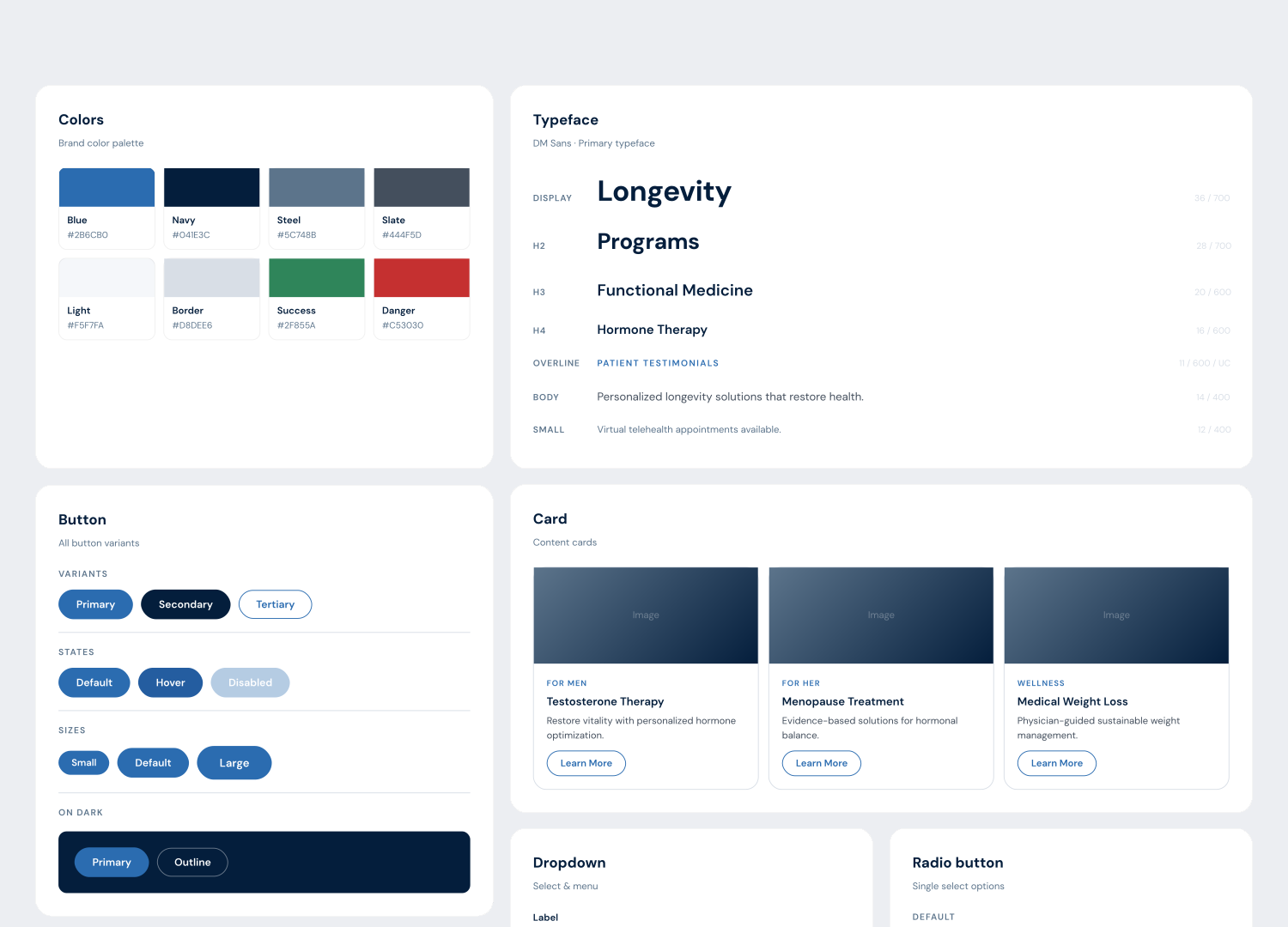
The client kept their vibrant blue CTA colour. I built around it — introducing deeper blues for hierarchy and authority. Bright blue stayed exclusively on CTAs. Everything else stepped back.
Onepage.io pushed toward simplicity, which worked better for the 55–85 demographic than a heavier design would have.
6 weeks to market was the real constraint. We hit it.
Saying No
The client wanted before/after photos and social media links throughout. Both pull users away from the page before they convert. Before/after photos stayed off. Social links moved to the footer. Every element either served conversion or stepped aside.
Launch. Learn. Fix.
We launched in 6 weeks. Then the client came back with feedback: patients sometimes struggled to find specific pages, even with the simplified navigation.
I made two changes:
— Simplified the top nav further with clearer labels
— Added a search icon in the header
The site kept improving after launch, and that cycle continued with every brand that followed.
The Numbers
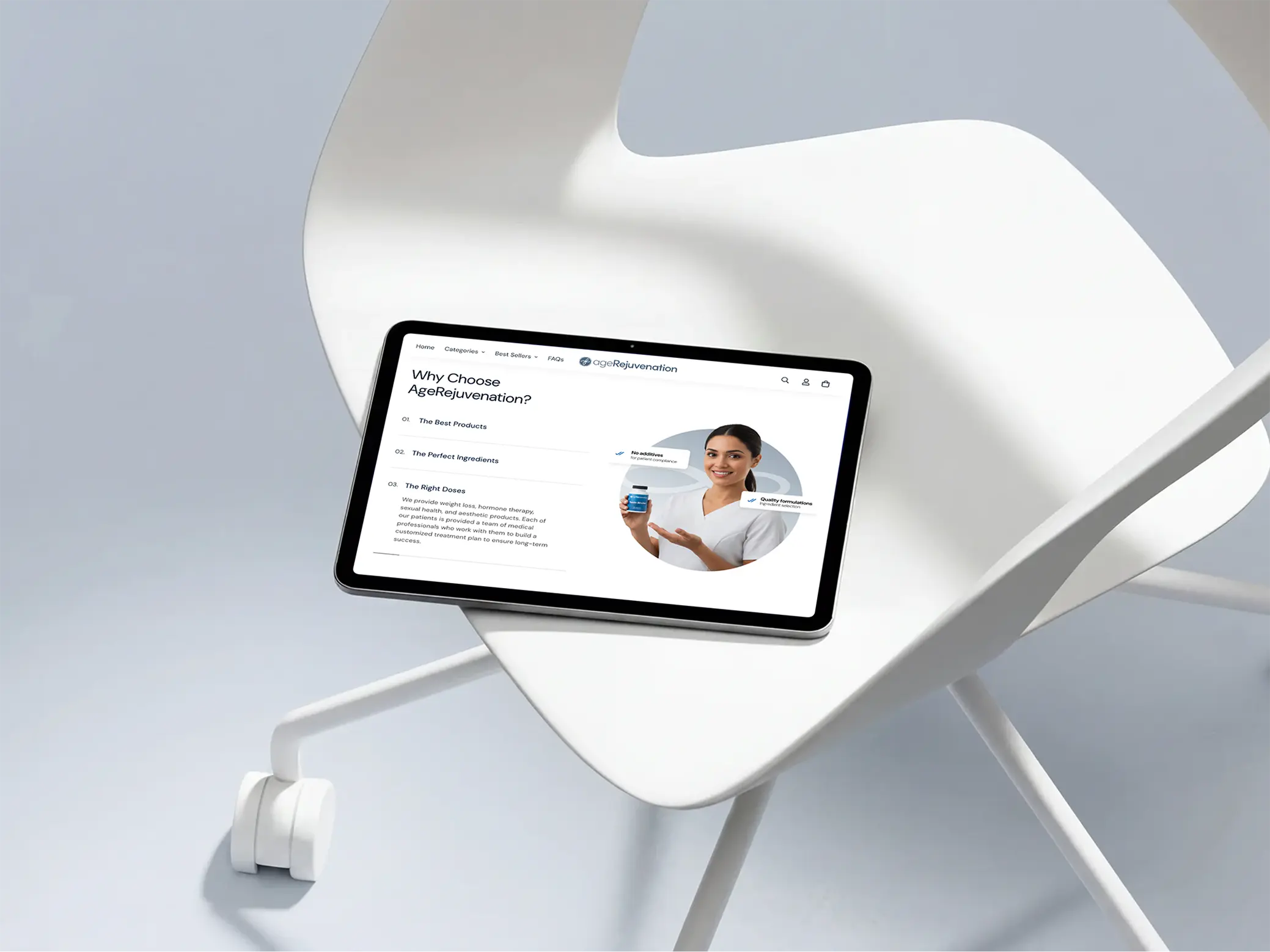
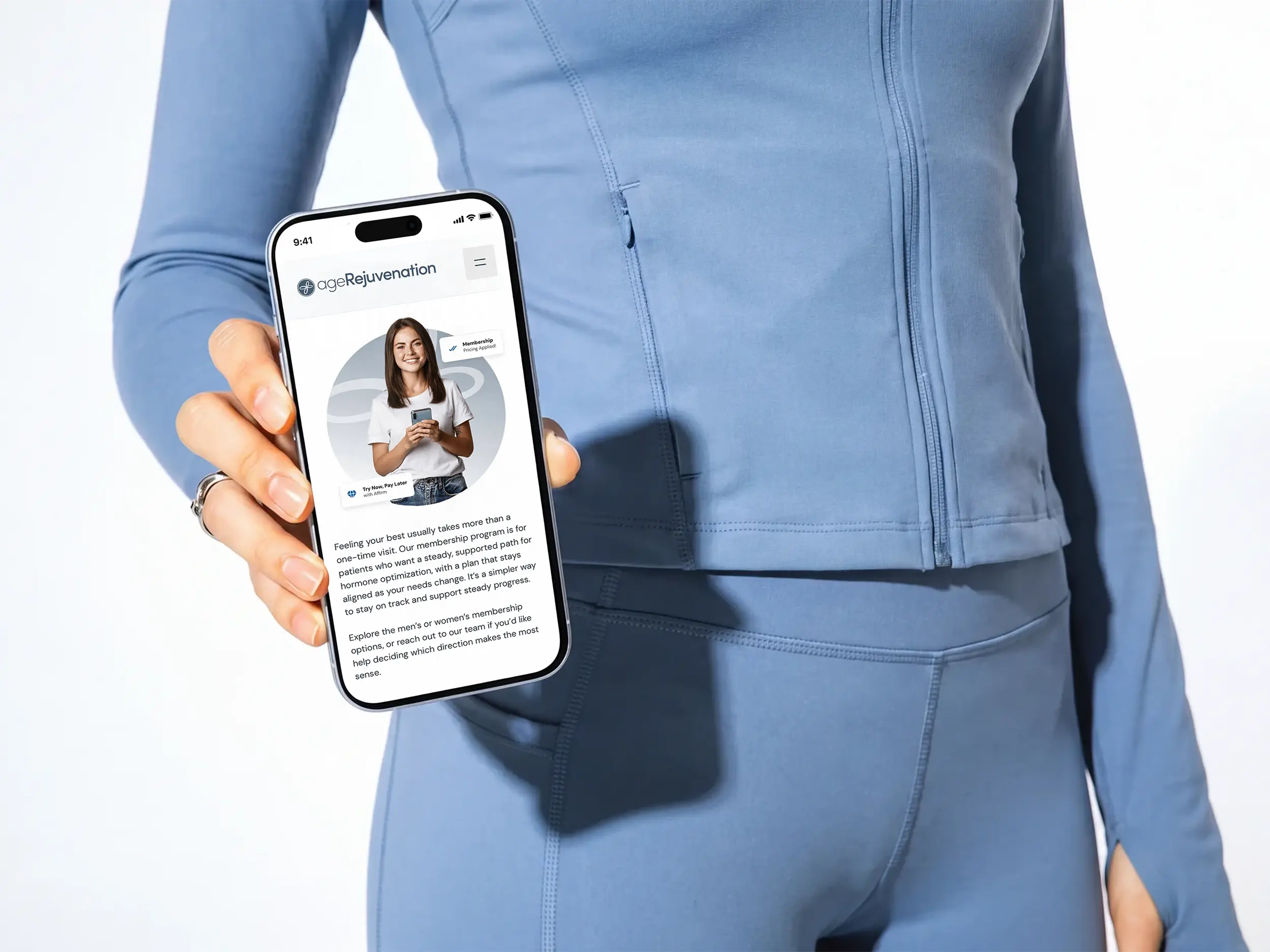
What started as one website became a long-term partnership. The client returned for 3 more brands, each with a full digital package. The design system built for the first brand became the foundation for everything that followed — good structure scales.
The site launched in August 2025 with zero existing traffic. In 12 months, hub-based architecture drove 27.4K organic clicks from 3.5M search impressions. Average search position climbed from around 30 into the top 15 across target keywords. 21,876 active users moved through the new structure, and 659 reached the booking page — proof that patients found their path instead of bouncing.
Personal Reflections
This project taught me that a designer's job is often synthesis under pressure. The SEO team had their logic, the client had their vision, and Onepage.io had its limits. My job was to take all of that in and make the final call.
The hardest skill was not design. It was knowing when to say no — to the client, to feature requests, to my own ideas that the platform could not support. That clarity is what kept the project moving.