Healthcare Website Redesign
A ground-up redesign for a multi-location healthcare network with 7 clinics spanning everything from physiotherapy to cosmetic surgery. Every design decision had one goal: define trust in a local patient.
Intro
Problem
The website ran 100+ treatments, 7 locations, and no hierarchy. Patients couldn't find the right treatment at the right location and left without booking.
Solution
Restructure the platform around one idea: get the right patient to the right stream fast. I created one unified structure with visual hierarchy that made each location's offerings distinct without losing what it meant to be part of a unified system.
Outcome
27.4K
visits in 12 months — doubled the track base 3x
26%
of all online bookings started to come through CTA
Client retention
direct client retained at full scope, no revision loop

Discover and Define
The UX Audit
The audit revealed the old website had 100+ treatments listed at the same hierarchy level — no grouping by condition or body area, and practically no calls to action for different clinic types.
3 Patient Profiles
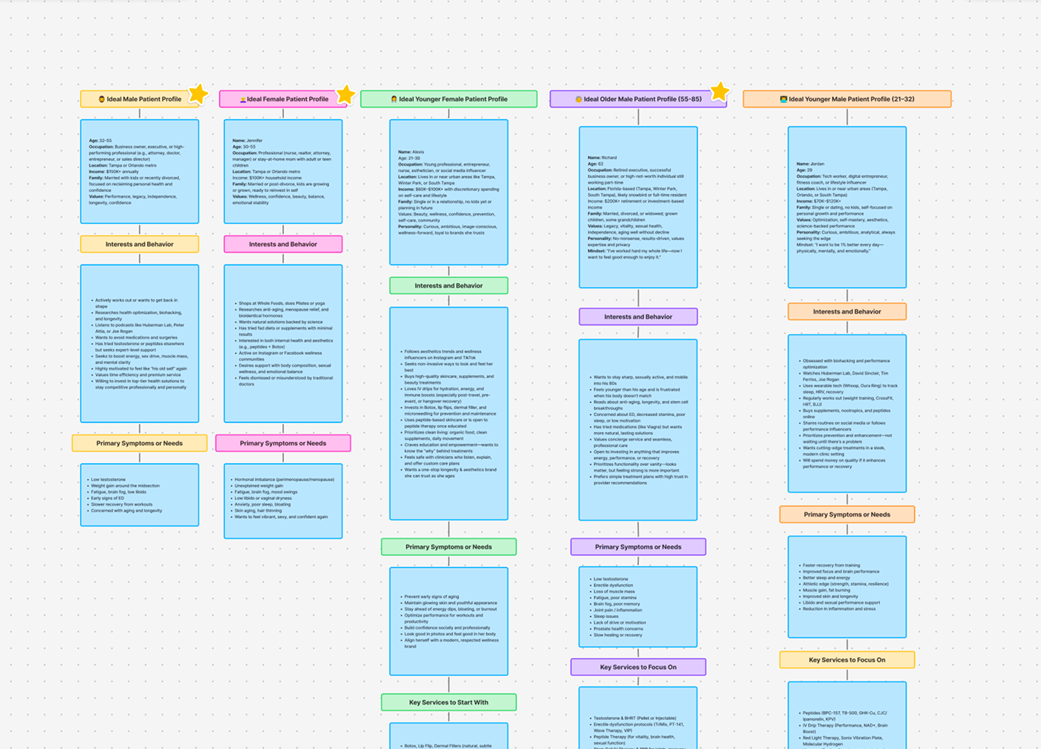
To figure out who actually visits a multi-location clinic set in a 100-page website, I built 3 patient profiles from analytics, keyword data, and real SEO search queries. They shaped everything: the navigation tree, CTAs, and content priorities — making sure each location spoke directly to its most likely patients.
Design Process
Two Layers, One Clear Path
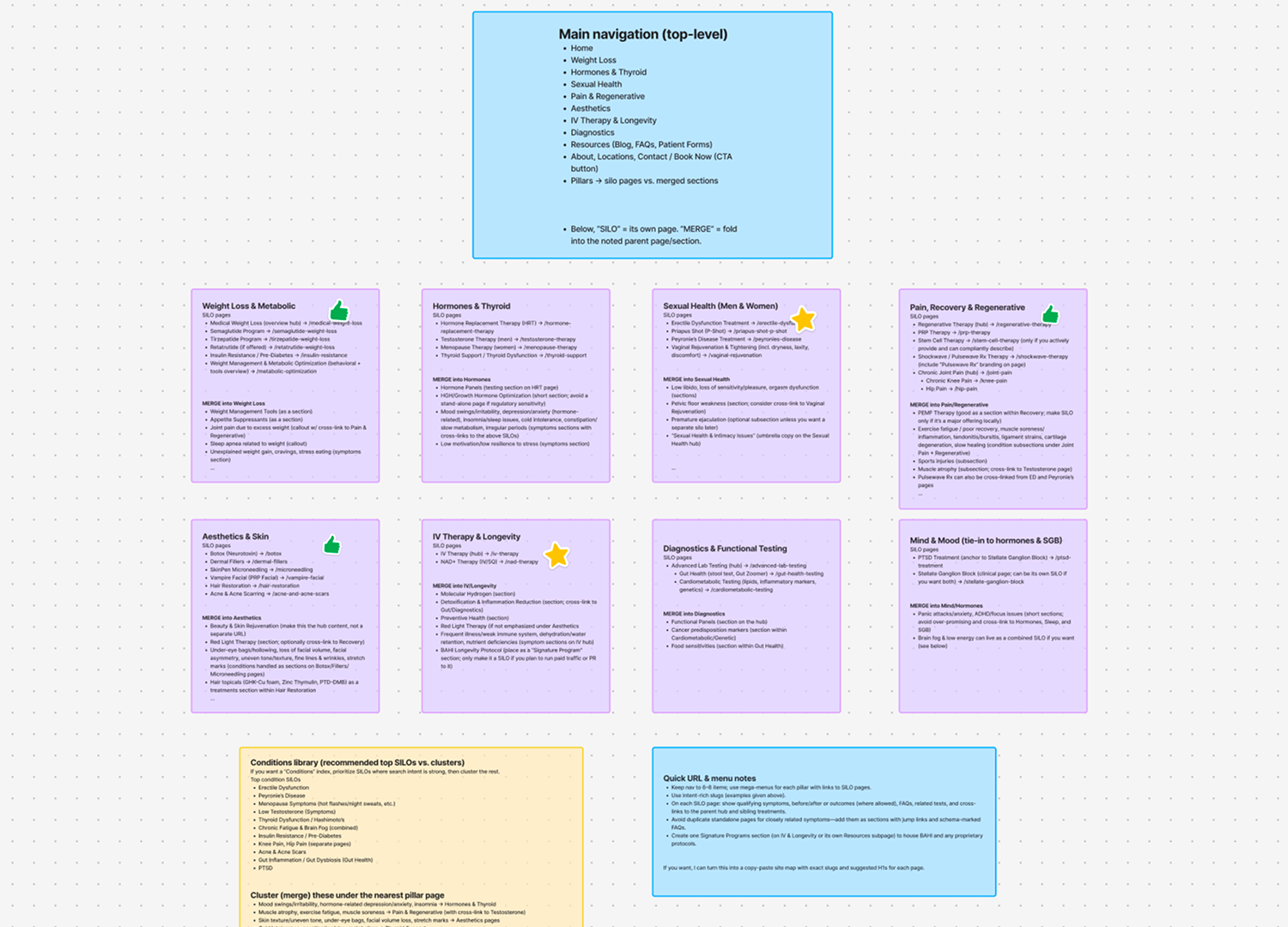
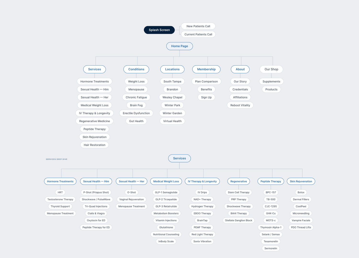
The clinic had 100+ services and workflows split in to two clear tiers: at the top level, 7 core treatment areas (e.g. Physiotherapy, Cosmetic Surgery, Dermatology); underneath, 100+ individual pages for specific treatments, each tailored to a real patient's real needs.
A patient browses the platform around one idea: get the right treatment in the right location fast — a simple hierarchy that connects the broad category to the specific procedure in just 2 clicks.
Every service fell into one of 6 to 8 subcategory overhaul buckets with the services rewritten into relevant groupings — reducing the patient's mental model self-selection to really comfortable levels.
Clinical Trust at Speed
The site had a flat clinical core: 100+ treatment pages, each packed with an enormous amount of clinical information to convey. BrightOne shaped wireframes + editorial workflows to CTAs.
It results in contact: Info, first; trust with APP. Not fluff.
Saying No
A simulated, real editorial style and consistency throughout. With each new URL, each new page of content — full editorial review. Forced to build it. The goal was intentional constraint: editorial + design finesse.
Post-launch
Launch. Learn. Fix.
We launched to users. Then held open sessions with feedback: patients tried to navigate appointment flows while we watched — what still confused people — and after those guided explorations:
— fixing a search bar in the header
The data kept improving after each fix. That's how it always works.


Impact
The Numbers
Twelve months in on an internally structured platform partnership — the client hit record-breaking numbers that had been previously unreachable for the company. With a 89% of all active interactions directly to the phone CTA — a metric that exceeded all initial expectations.
Personal Reflections
The nicest and most telling result is that continued online presence — the KEBDC team launched their next clinic and Reframed franchise to us.
The market and each design, it was knowing when to say no — at the brief, to the concept homepage, or during post-launch — is what keeps the UX tight, the content clear, and the outcomes real.
The take-away: stop selling treatments. Start solving specific fears.